For more than twenty years KOMA created a series of annual calendars shared with clients, collaborators and friends of the studio. What began as a simple New Year gesture gradually evolved into a small design tradition and a platform for experimentation.
The inaugural 2003 edition set the tone for the series by incorporating fragments from Bruce Mau’s Incomplete Manifesto for Growth, establishing a dialogue between design practice, visual research and critical thinking that continued to evolve in the years that followed.
The 2004 edition focused on famous Latin phrases, reinterpreted through bold contemporary typography and cutting-edge typefaces of the time. Classical wisdom was visually translated into a modern graphic language, creating a dialogue between historical thought and early-2000s typographic expression.
The 2005 edition revisited Bruce Mau’s Incomplete Manifesto for Growth, this time through a more expressive and experimental visual approach. Printed with three fluorescent inks and black, the calendar embraced bold contrasts, energetic compositions and a more provocative graphic language, expanding the ideas explored in earlier editions.
The 2006 edition explored playful Macedonian slang expressions through a visually unconventional approach. The design combined ASCII art structures with flowing vector floral elements, creating a contrast between digital rigidity and ornamental softness while celebrating everyday language and local humor.
The 2007 edition was dedicated to women, presenting a curated selection of notable quotes reflecting on femininity, strength and social roles. The visual approach was deliberately diverse, combining vector graphics, collage compositions and photographic manipulations to mirror the complexity, multiplicity and expressive richness of women’s identities.
2008 — KO MAшина
Created to mark 15 years of KOMA Design Studio, this edition played with the double meaning of the studio name as both identity and mechanism. The concept revolved around twelve wordplays derived from “KO MA”, forming a system of playful linguistic constructs. The calendar featured a minimalist geometric calendarium paired with strong photographic compositions, balancing precision and expressive visual storytelling.
he 2009 edition explored historical narratives through layered photographic collages. Iconic moments from world history were combined with local imagery from Macedonia and references to significant figures from Macedonian history, creating unexpected visual dialogues between global events and local memory.
The 2010 edition returned to Bruce Mau’s Incomplete Manifesto for Growth as a conceptual backbone. The design centered on photographic compositions integrated directly with the calendarium, while expressive, deliberately unconventional typography echoed the experimental graphic trends of the time.
The 2011 edition presented fourteen ultra-short stories curated by Nikola Gelevski. The design adopted a warm, friendly tone, pairing the texts with original vector illustrations that aimed to capture the essence and subtle atmosphere of each miniature narrative.
The 2012 edition featured paintings from the New Religion series by Koma designer and artist Marija Smilevska. The calendarium was integrated with the artworks through unconventional layouts and collage-like compositions, creating a dialogue between structured timekeeping and expressive visual art.
Marking 20 years of KOMA Design Studio, the 2013 edition revisited the playful KO MA wordplay system introduced earlier, generating a new set of twelve linguistic variations derived from the studio name. The visual narrative revolved around the studio’s first car from 1993 — a white Zastava 750 (“Ficho”) — used as a nostalgic motif throughout the calendar. The edition concluded with a printed paper model of the iconic car, allowing users to cut, assemble and build it into a small three-dimensional object.
The 2014 edition celebrated memorable quotes from Macedonian films. The calendar combined hand-painted watercolor illustrations by Koma designers Marija Smilevska and Frosina Coneva with graphic design elements, creating a distinctive dialogue between cinema history, illustration and contemporary visual interpretation.
The 2015 edition explored a graphic dialogue between engraved botanical illustrations and sharp geometric vector forms. Vegetables and floral elements were paired with circular motifs and segmented shapes suggesting the passage of time through visual “quarters.” The calendar was printed in a striking black-on-yellow palette, using yellow stock paper and a single black ink to achieve a bold, high-contrast result.
The 2016 calendar paid tribute to the anonymous typographers and sign painters who shaped the visual language of the city in past decades. The design assembled collages of photographed street signs, shopfront lettering, institutional plaques and directional boards collected across Macedonia. Rendered in a restrained duotone black-blue palette, the project celebrated the raw typography of everyday urban culture and preserved fragments of a disappearing visual heritage.
The 2017 calendar shifted towards a purely graphic language. Minimal geometric compositions were combined with tiny human figures to create subtle visual narratives about scale, perspective and everyday observation. Clean layouts, restrained color accents and precise typographic structure produced a quiet, conceptual calendar where small interventions generated playful spatial illusions.
Marking 25 years of KOMA Design Studio, the 2018 calendar was built around the idea of a quarter century. Each page features a die-cut quarter of a circle, creating a continuous opening that runs through the entire calendar. The design embraced strict minimalism, using simple geometric logic and bold color surfaces to turn the physical object itself into the central visual gesture.
The 2019 calendar focused on raising awareness of women’s strength, solidarity and social presence through a series of positive, empowering messages. The visual language was built around minimal line illustrations by Dušica Dimitrovska Gajdovska, all drawn with a single continuous stroke weight, creating a clean and expressive graphic style. Some illustrations subtly referenced iconic design imagery where women appear as central, active figures.
Printed on red stock paper using black and silver inks, the calendar combined activist messaging with a restrained aesthetic influenced by Japanese minimalism. Short Japanese translations accompanied selected phrases, reinforcing the calm yet powerful visual tone of the project.
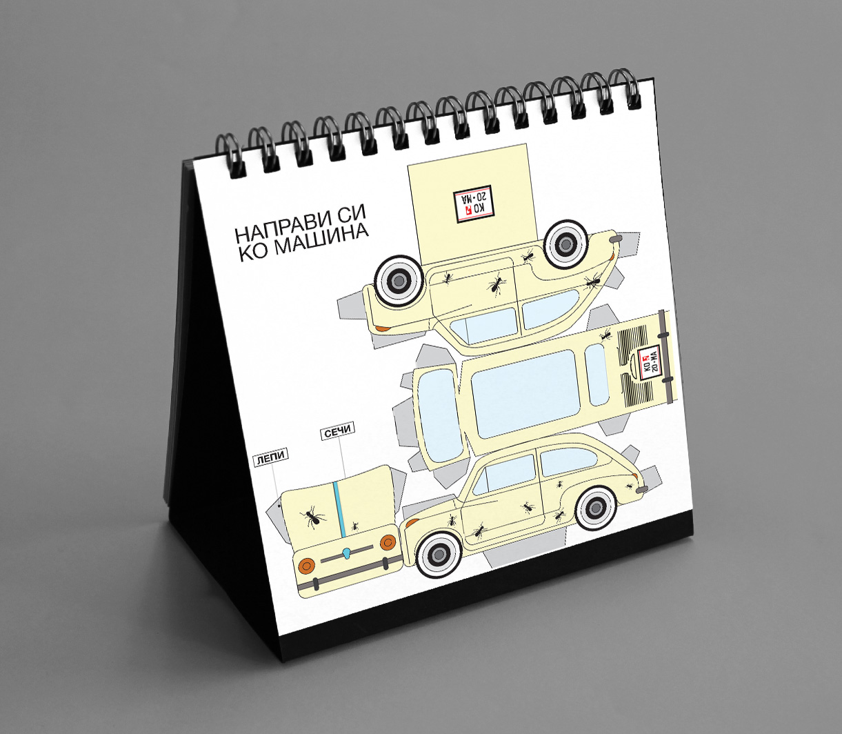
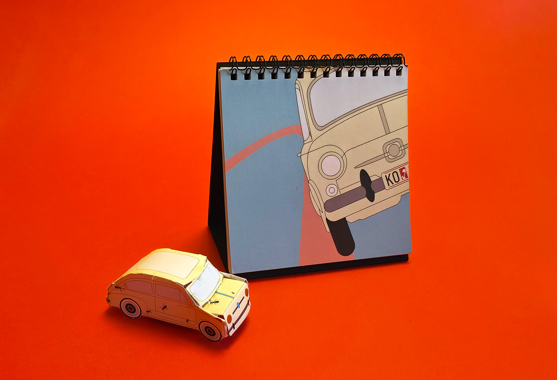
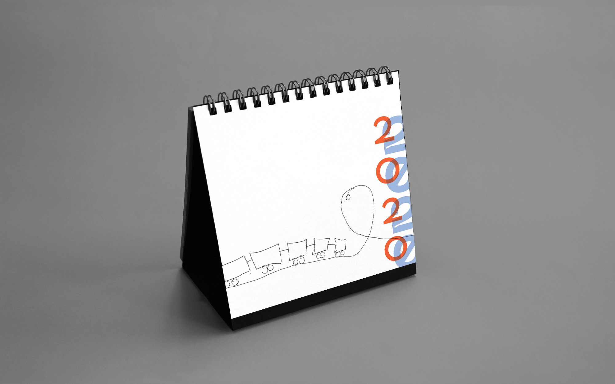
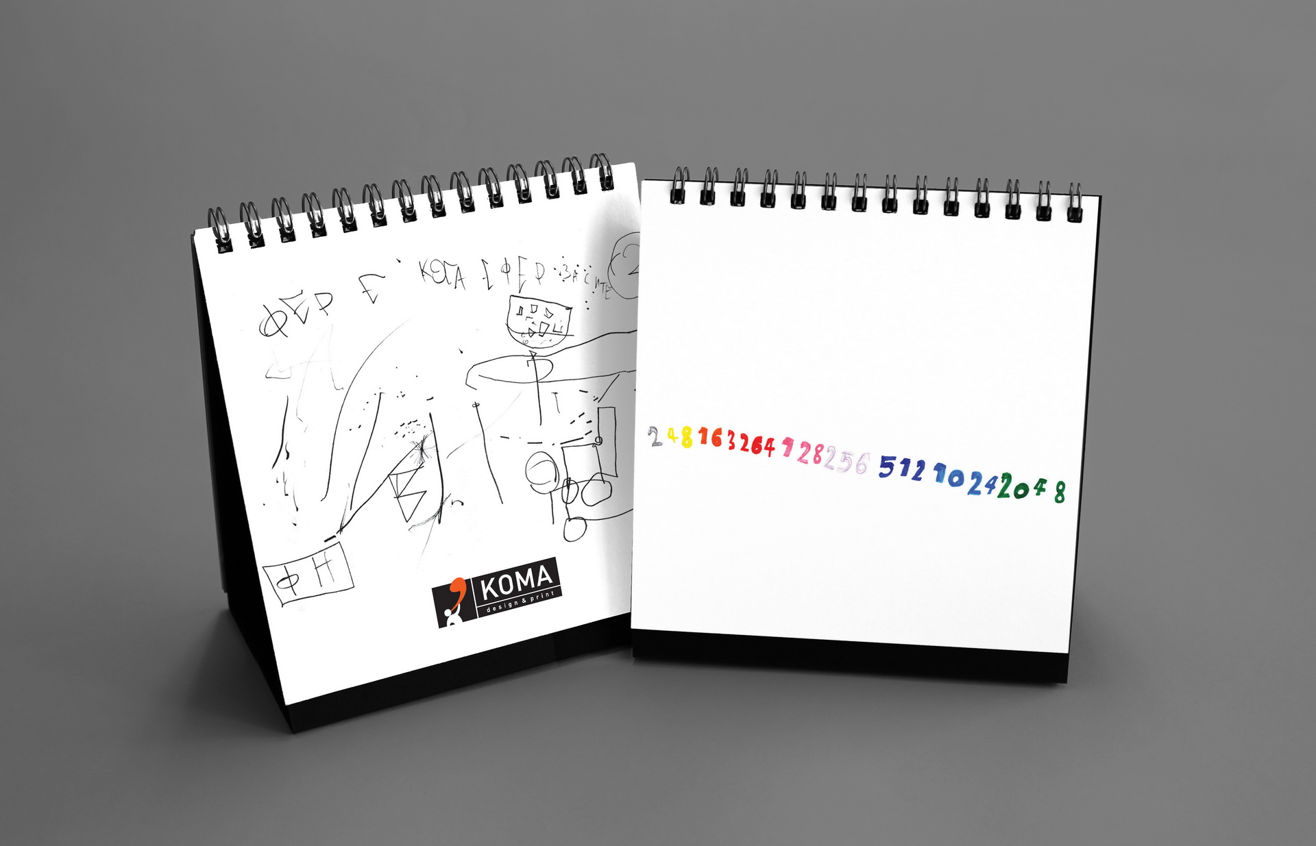
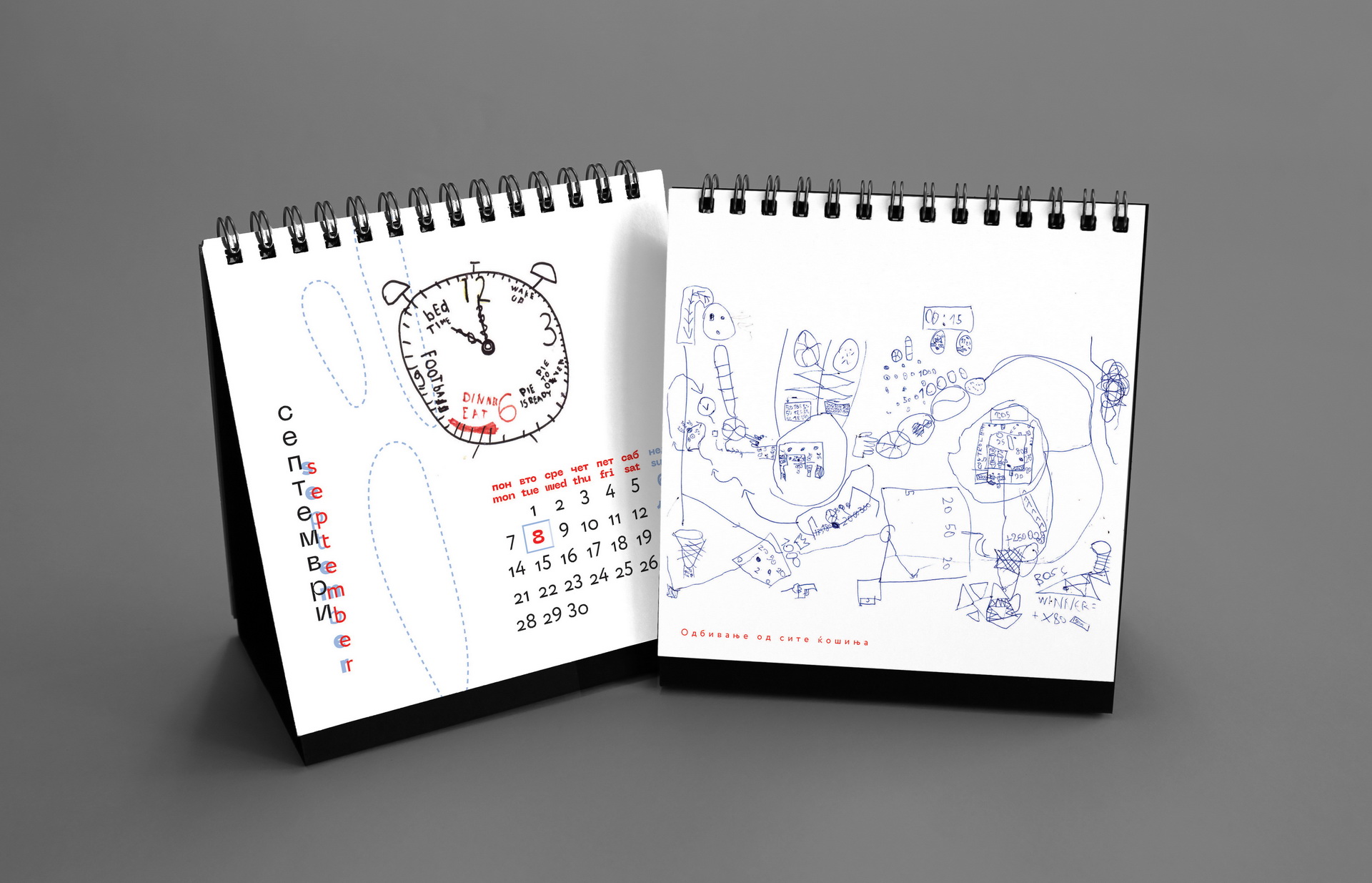
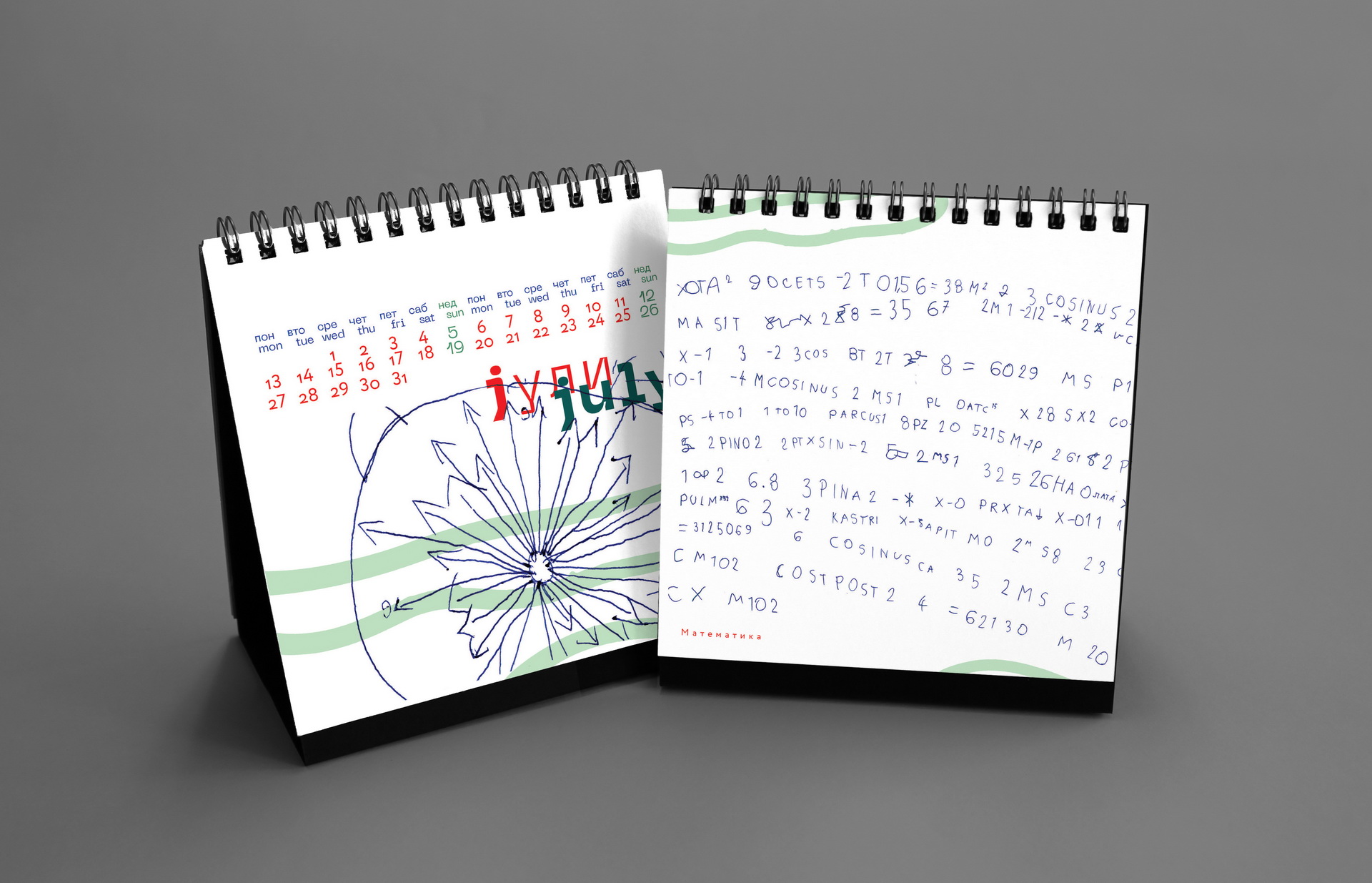
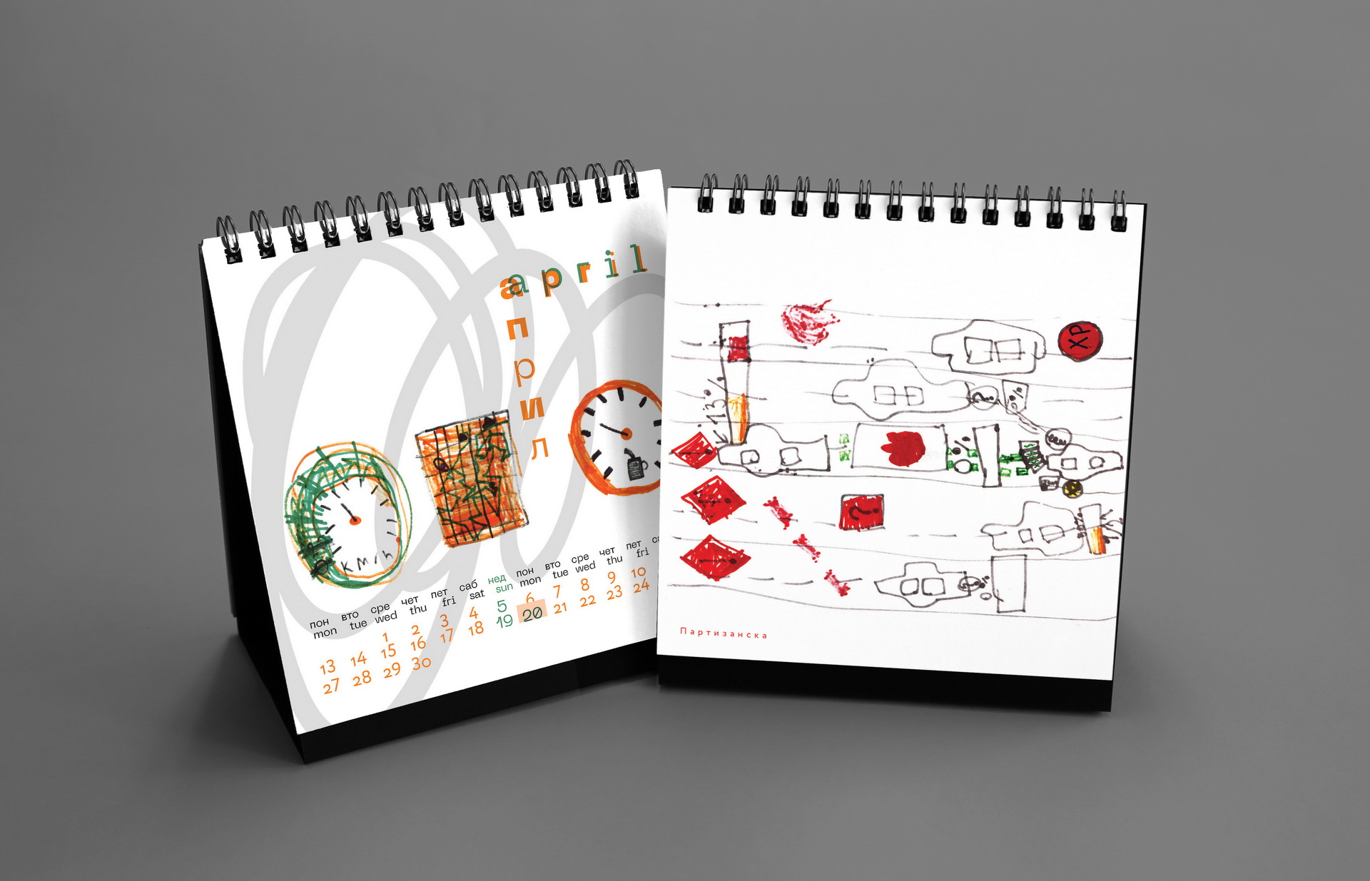
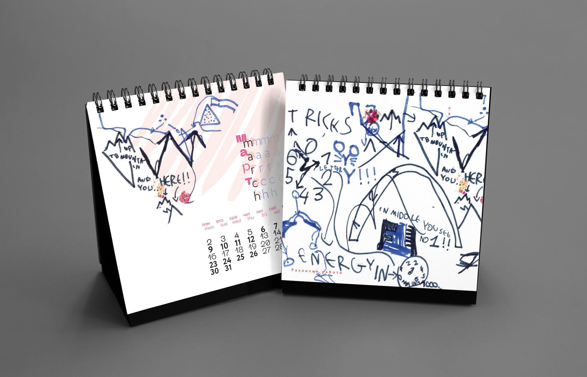
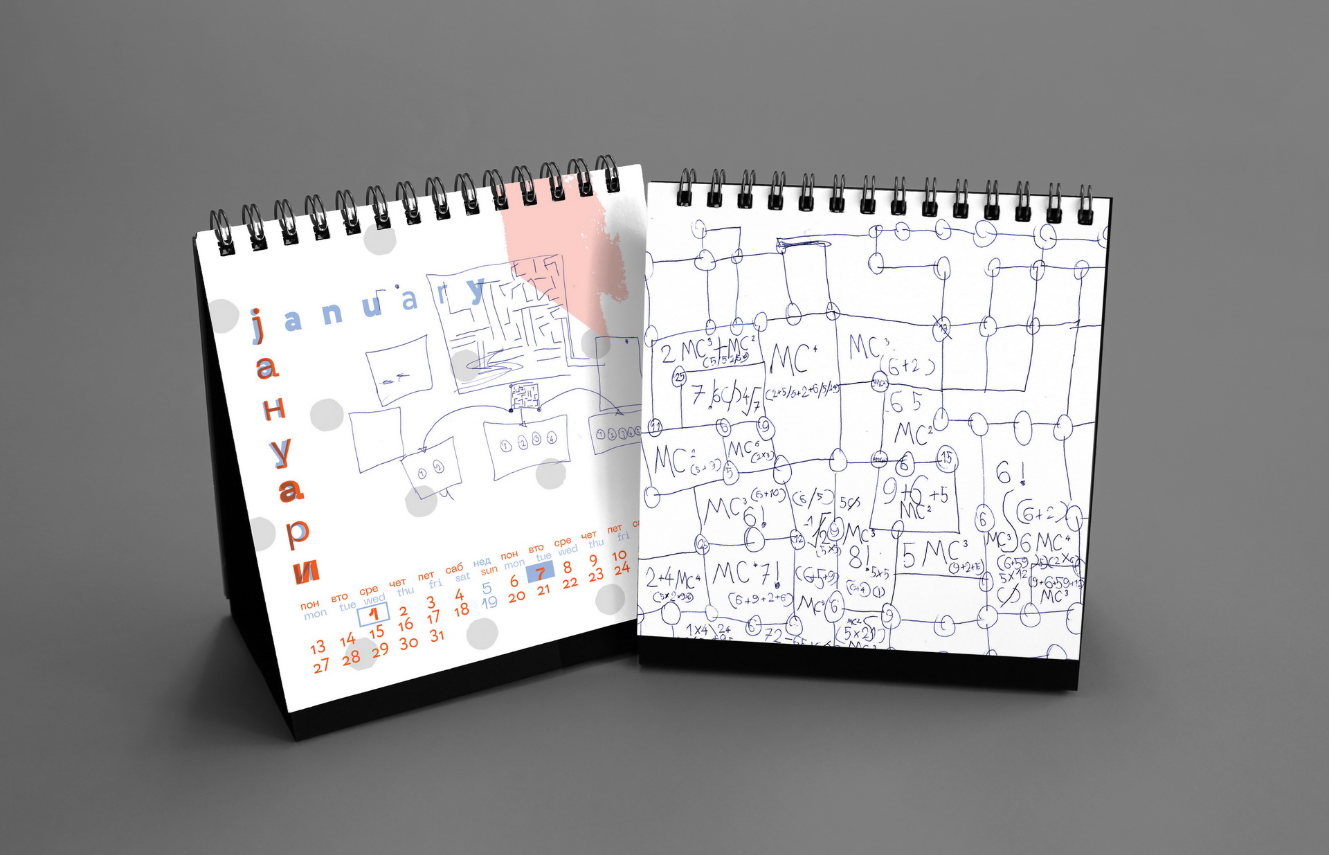
The 2020 calendar featured drawings by Nikola Josifoski, created between 2016 and 2019 when he was just seven years old. Fascinated by old Skopje, vintage cars, speedometers and planets, Nikola fills his notebooks with energetic sketches and imaginative diagrams. His favorite cars include the Honda Civic from the 1990s, Ferrari 308 GTS, Zastava 750 and the classic Chevrolet Bel Air, while his dream car is an Audi R8.
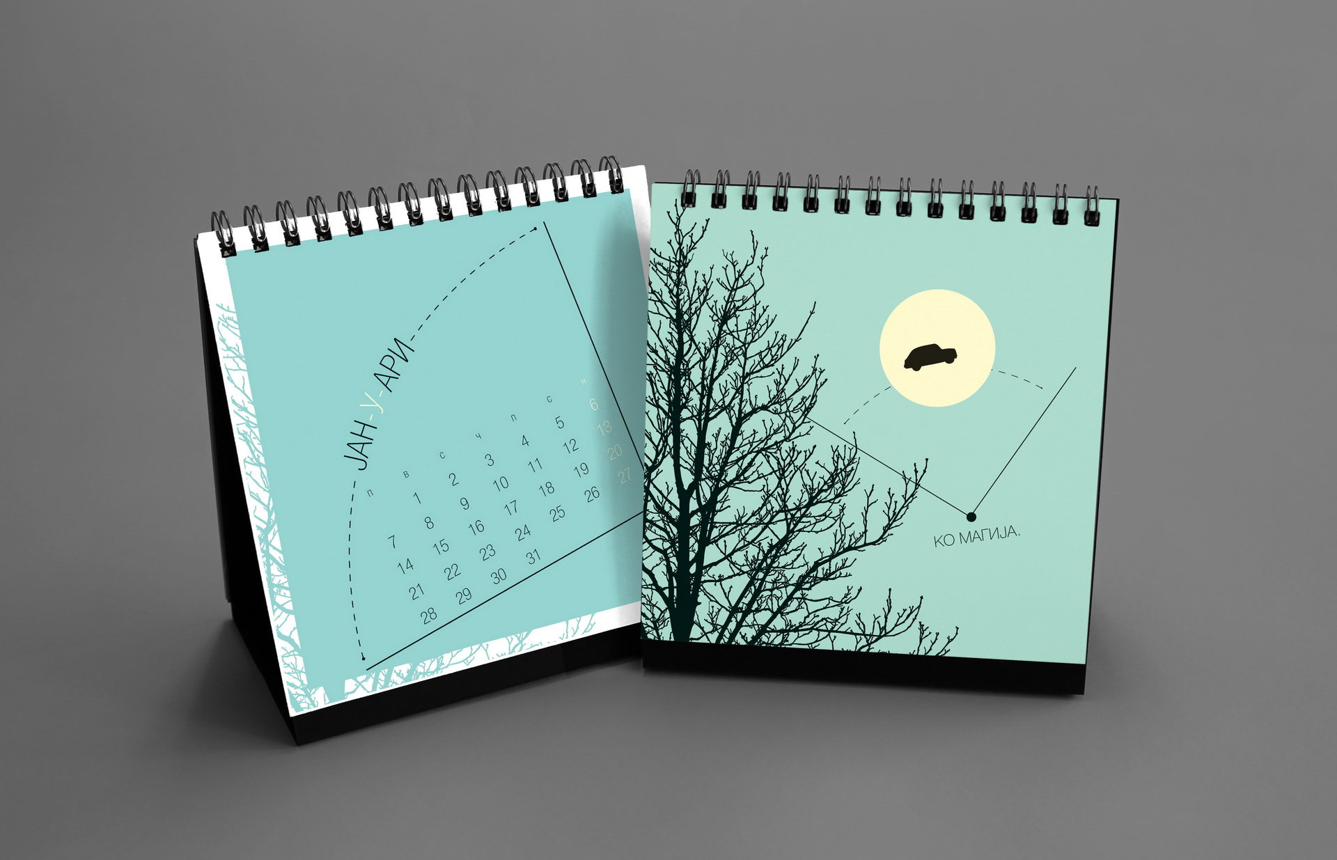
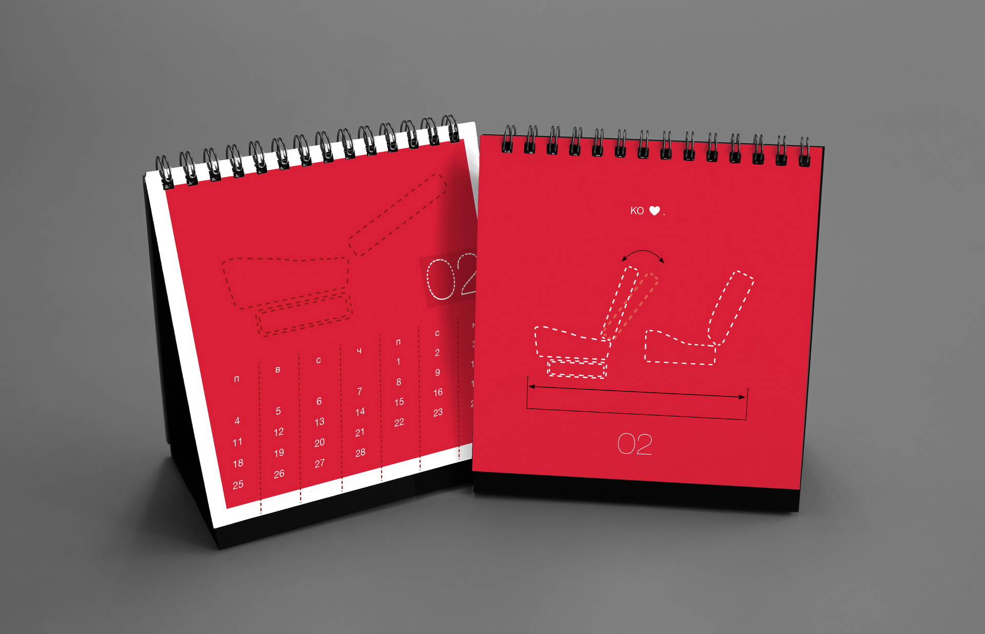
The design remained intentionally minimal, allowing Nikola’s spontaneous drawings to become the central visual element of the calendar.
Nikola — thank you again from the Koma team.
Marking 30 years of KOMA Design Studio and two decades since the first KOMA calendar, the 2023 edition revisited Bruce Mau’s Incomplete Manifesto for Growth. In contrast to earlier minimal approaches, the design embraced a deliberately maximalist language of collage, halftone textures, grunge layers and expressive typography.
The visual identity revolved around a simple punctuation mark — dot, dot, comma — a playful reference to the studio’s name, where the final “comma” replaces the expected third dot.
Context
For more than two decades KOMA produced an annual calendar as a small experimental design project shared with clients and collaborators. Each year explored a new theme, technique or visual language — from typography, illustration and photography to conceptual and material experiments.
Approach
The calendar became a laboratory for ideas. Every edition started from a clear concept and translated it into a distinct visual system, often pushing printing techniques, graphic language or narrative formats beyond everyday commercial design.
Why it mattered
Although fewer people today use desk calendars or paper agendas, many clients still ask for them every year. For us, the series remains a meaningful tradition — a space for freedom, experimentation and a tangible way to share our design thinking.