Milica Stojanova — Monograph
The cover concept is built around contrast: soft velvet-like cloth paired with raw cardboard, reflecting the duality within the personality of actress Milica Stojanova. Her portrait appears only as a shadow, suggesting a life shaped by the many characters she embodied on stage.The book was later exhibited as part of the Mikser Festival program across the Balkans.
Connect the Dots by Nikolina Andova Shopova
For the poetry book Connect the Dots by Nikolina Andova Shopova, the cover was conceived as an unfinished visual puzzle. Randomly scattered dots invite readers to draw their own connections. Each copy was distributed with a pencil and a red elastic band attached to the cover, turning the design into a participatory act.
How to Be Gay by David M. Halperin
The cover for How to Be Gay by David M. Halperin explores themes of visibility, identity and social perception. Printed on gold paper, the cover features a cut-out window revealing the title through a translucent pink film. The design plays with the metaphor of “seeing through pink glasses” while simultaneously suggesting the idea of living behind a filter — partially visible, yet never fully exposed.
12 Macedonian Photographers
The design for 12 Macedonian Photographers transforms the book into a minimal camera-like object. A black matte dust jacket with circular cut-outs reveals the silver hardcover beneath, creating the visual impression of a lens and sensor. When placed horizontally, the composition subtly resembles the body of a camera, reinforcing the photographic theme of the publication.
The book series The City
The book series The City critically reflects on the architectural transformations associated with the project Skopje 2014. The covers are printed on natural cardboard stock whose tone recalls the texture and memory of the old city. Blurred photographs of Skopje landmarks are overlaid with a dirty raster pattern, suggesting layers of imposed changes and visual noise that disrupt the city’s original character.
The title appears on a glossy, brightly colored sticker that is physically stitched onto the cover. This artificial, almost intrusive element contrasts with the muted background and symbolically represents new architectural interventions being “sewn” onto the existing urban fabric.
Context
These projects bring together a selection of book covers created for different publications, ranging from poetry and literary essays to cultural and urban criticism. Although developed for different contexts, they share a common intention: to treat the book not only as a carrier of text but as a designed object whose physical presence can communicate meaning.
Approach
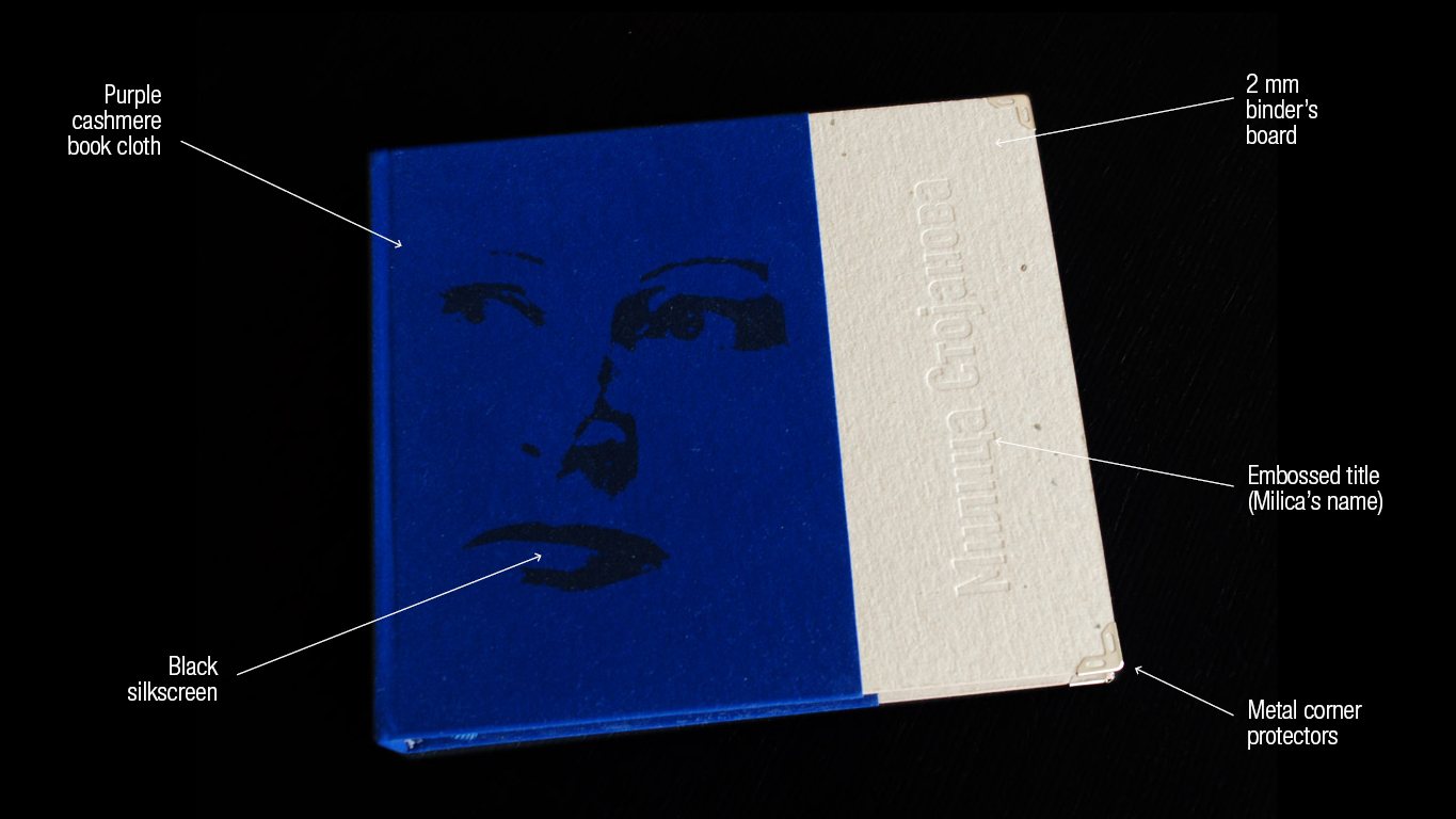
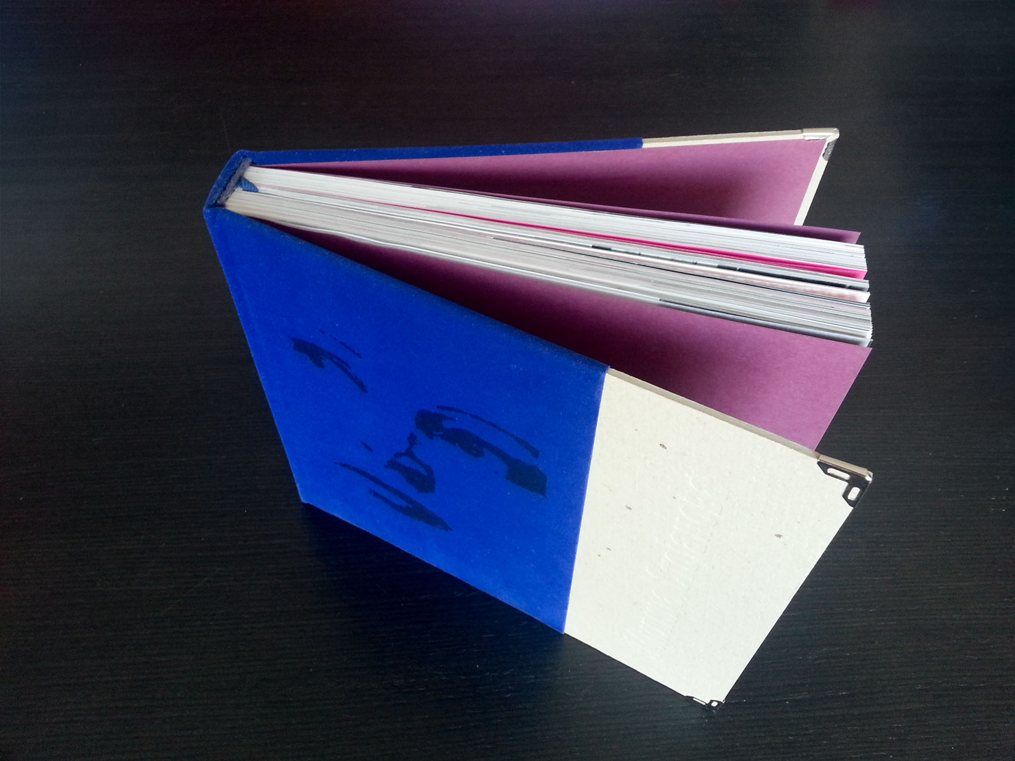
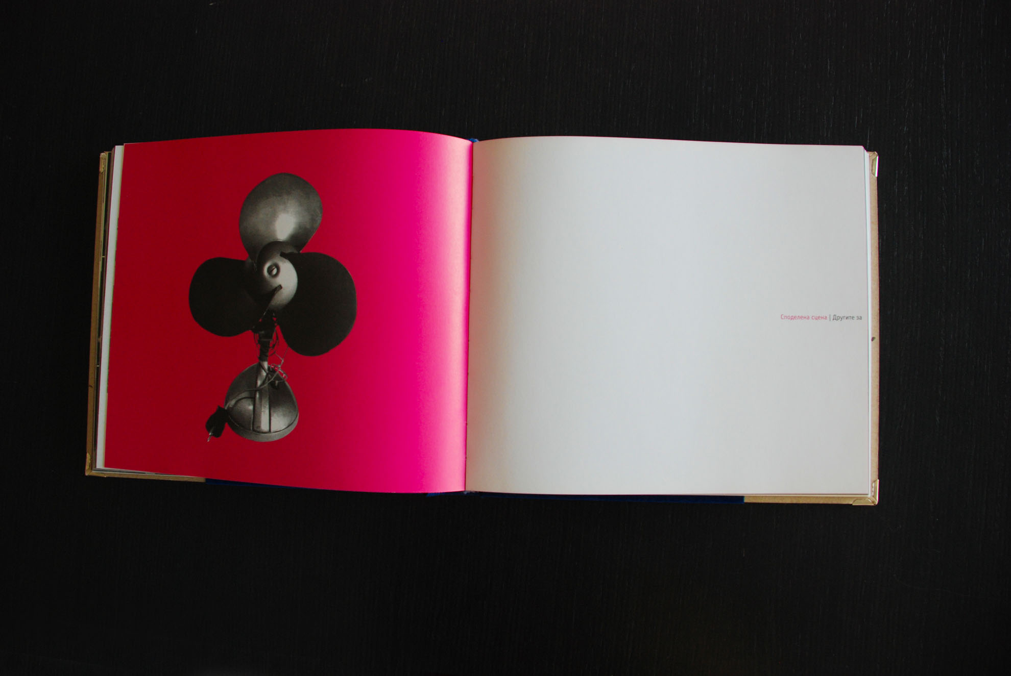
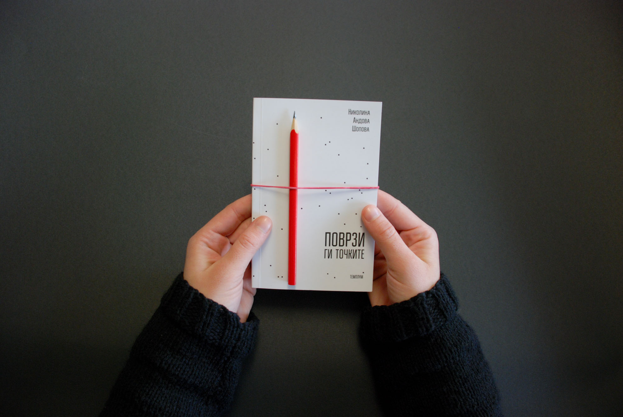
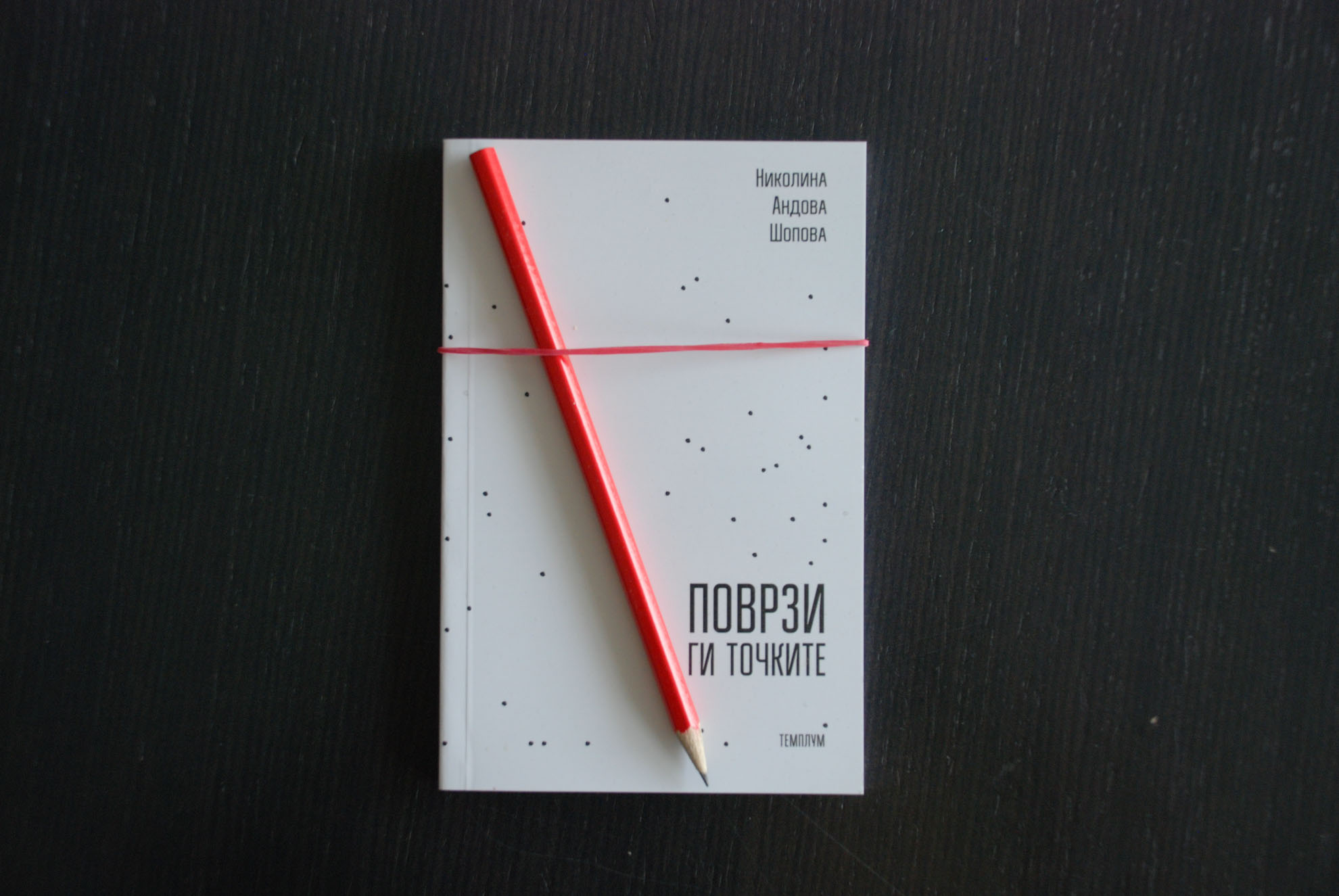
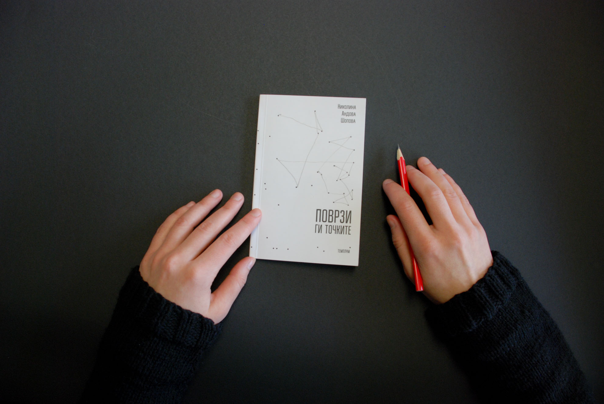
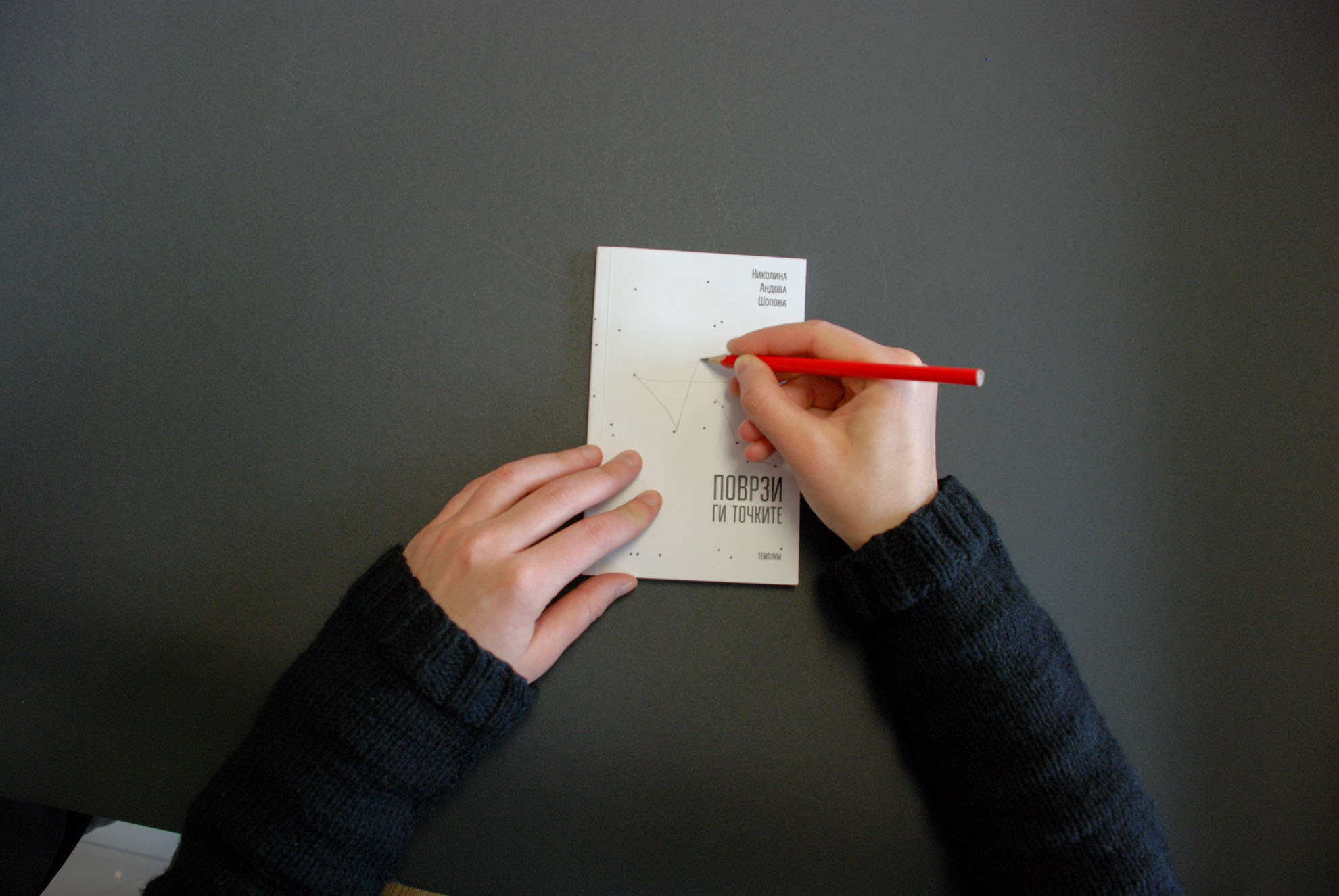
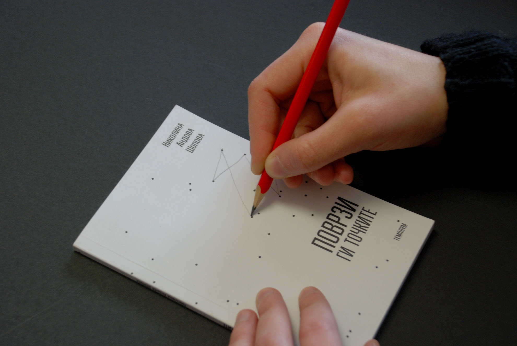
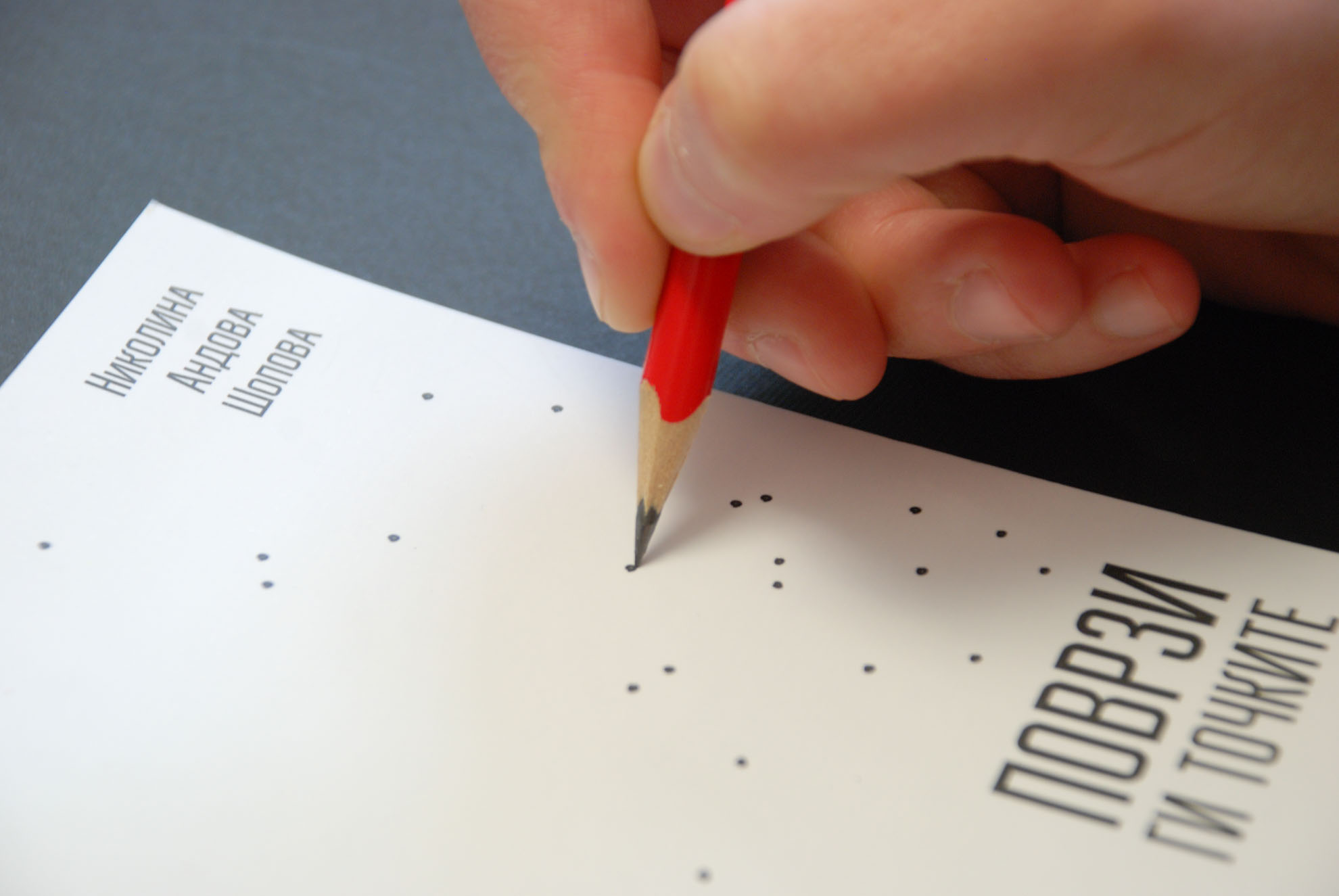
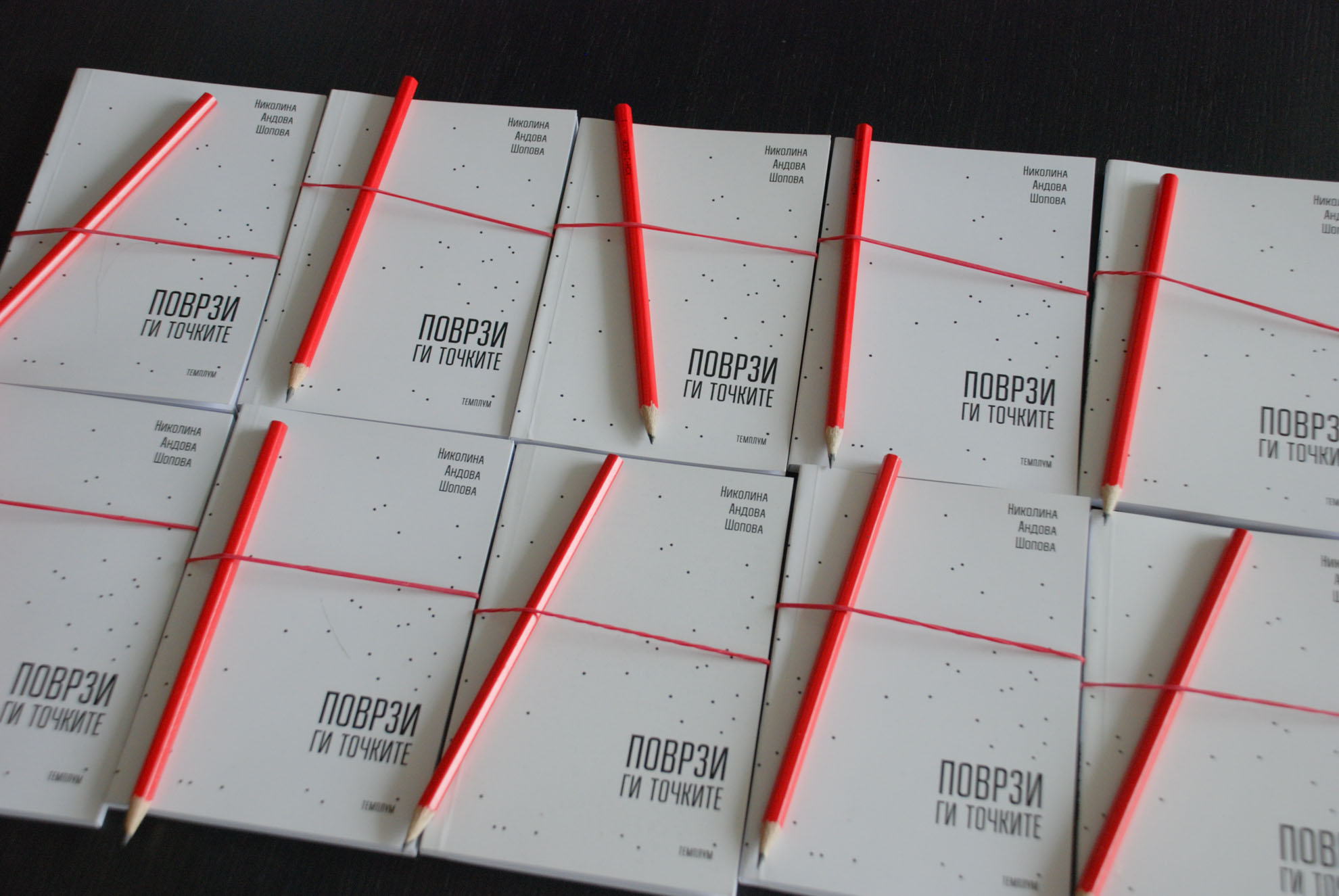
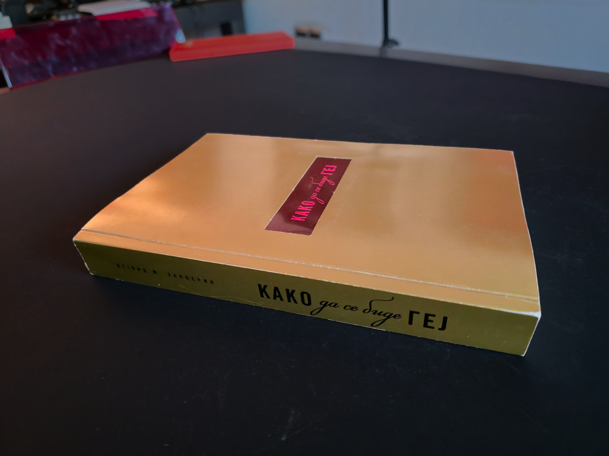
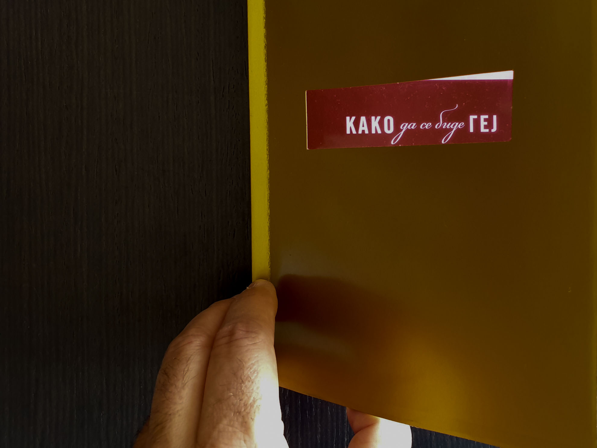
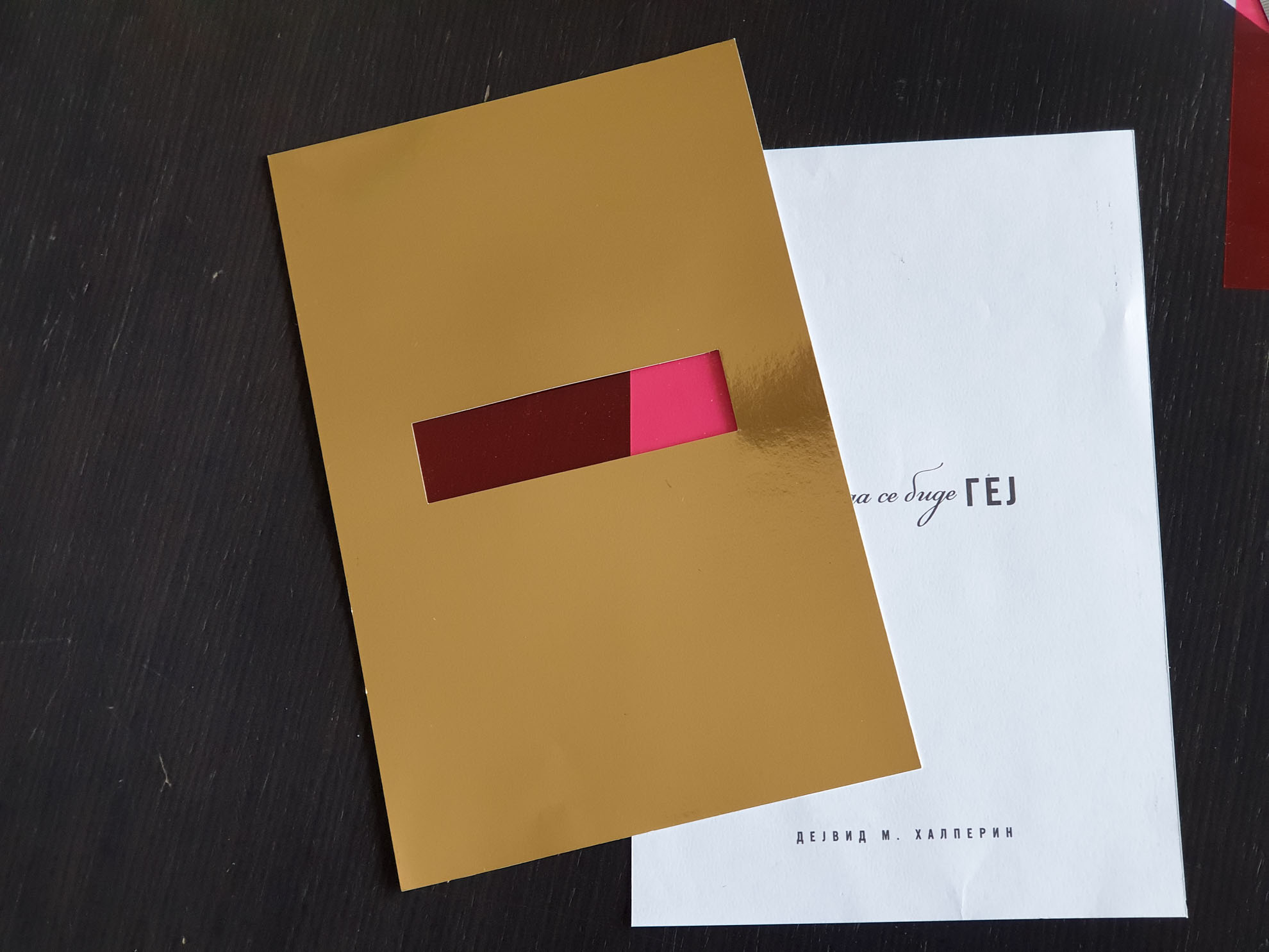
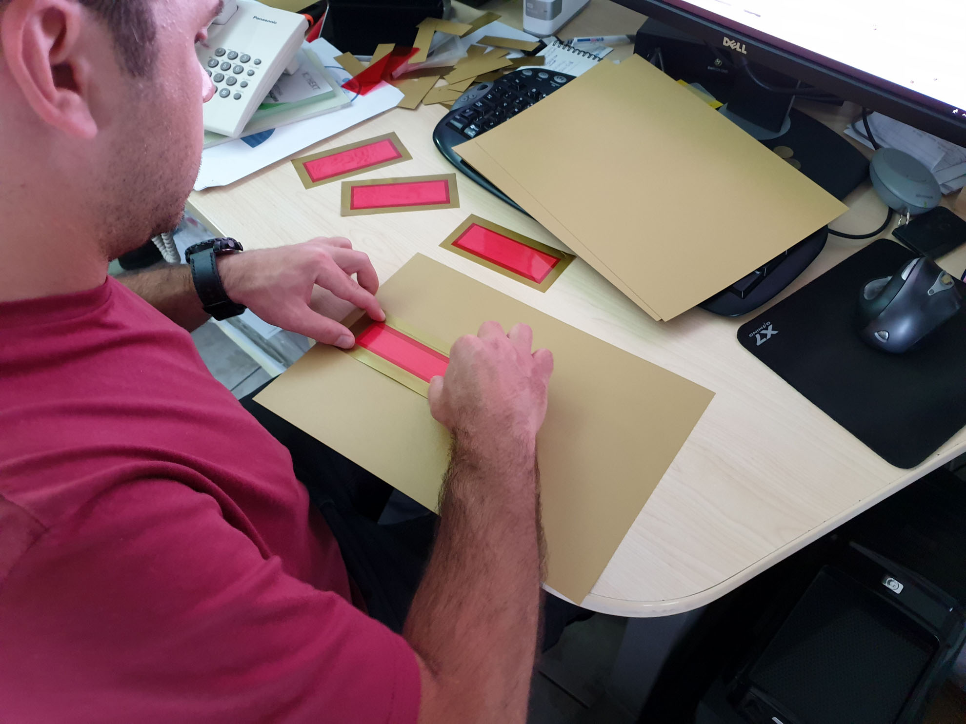
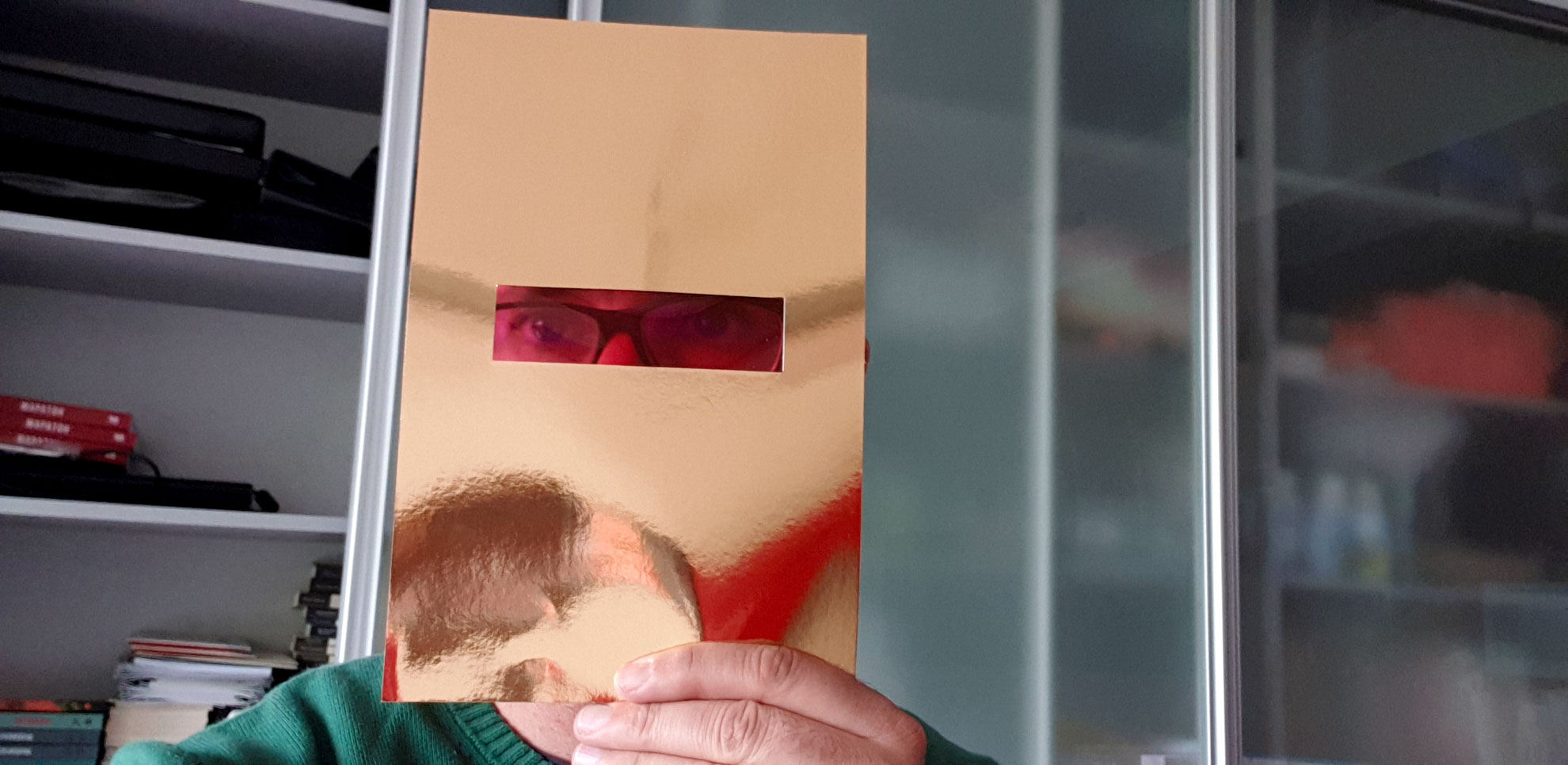
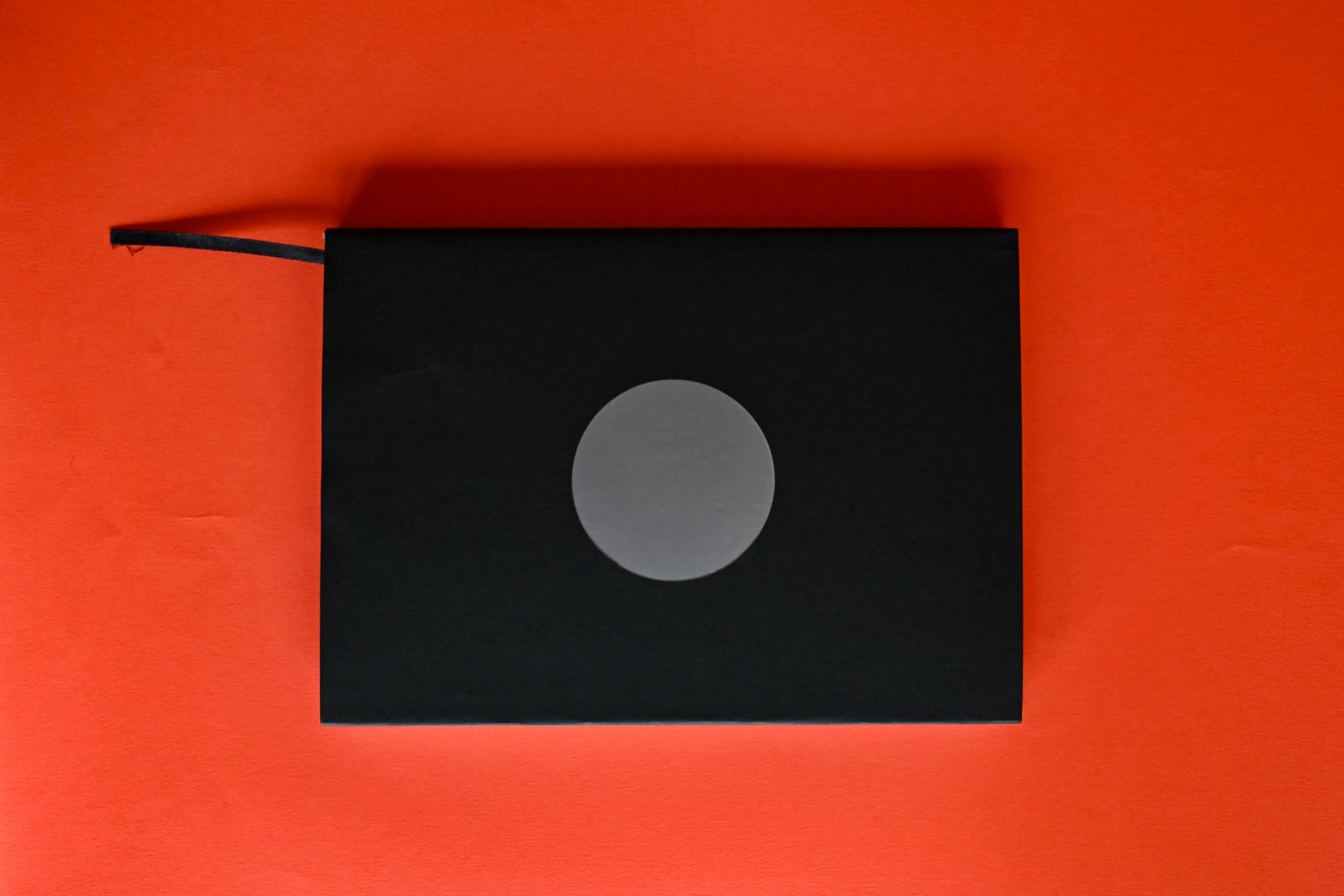
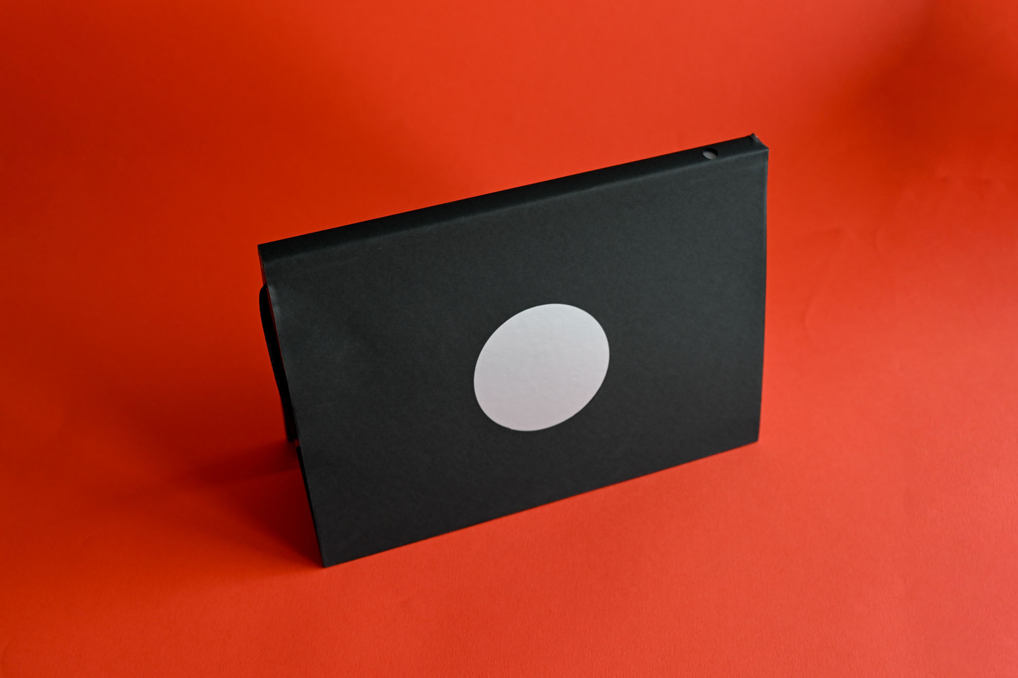
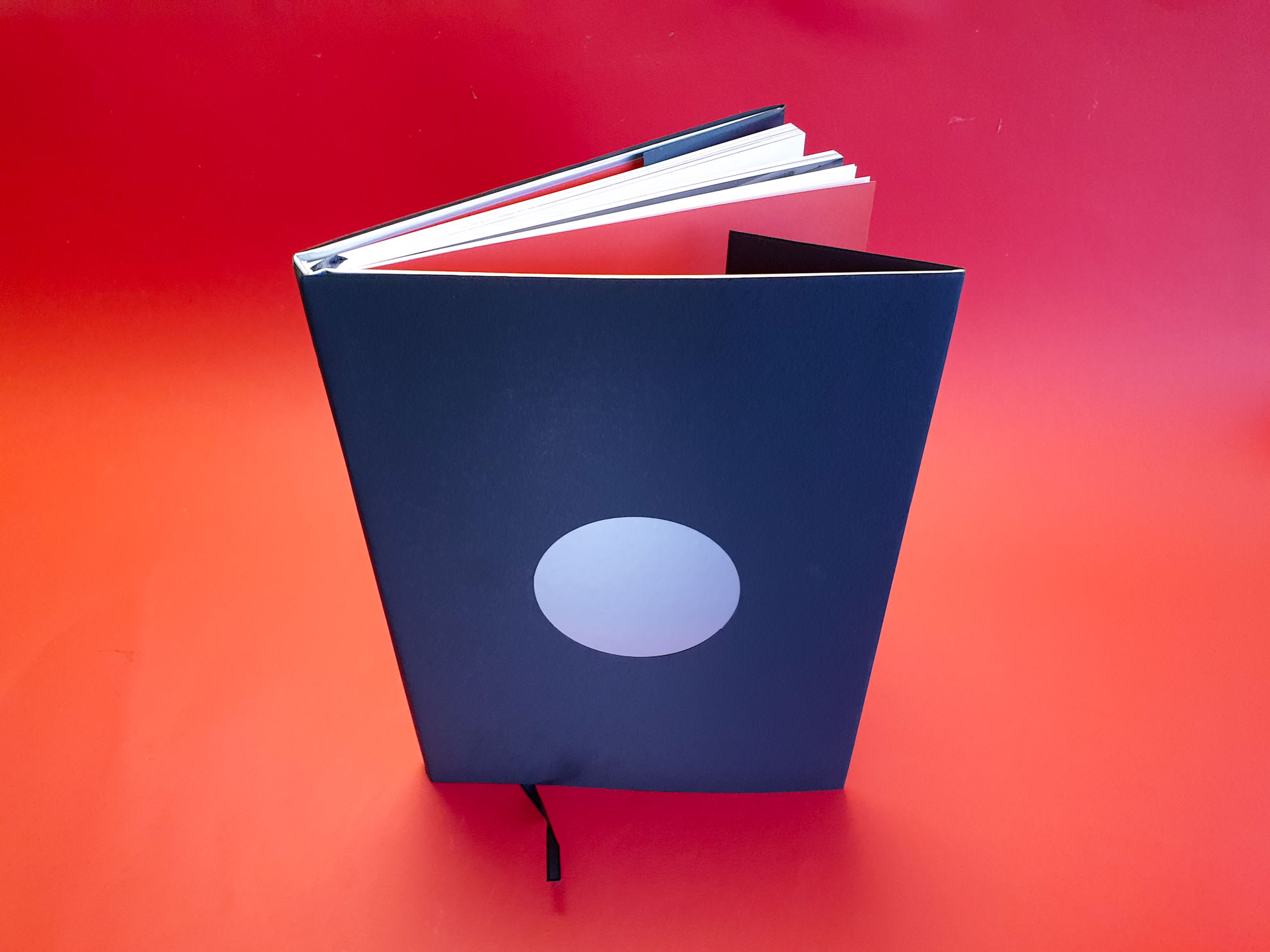
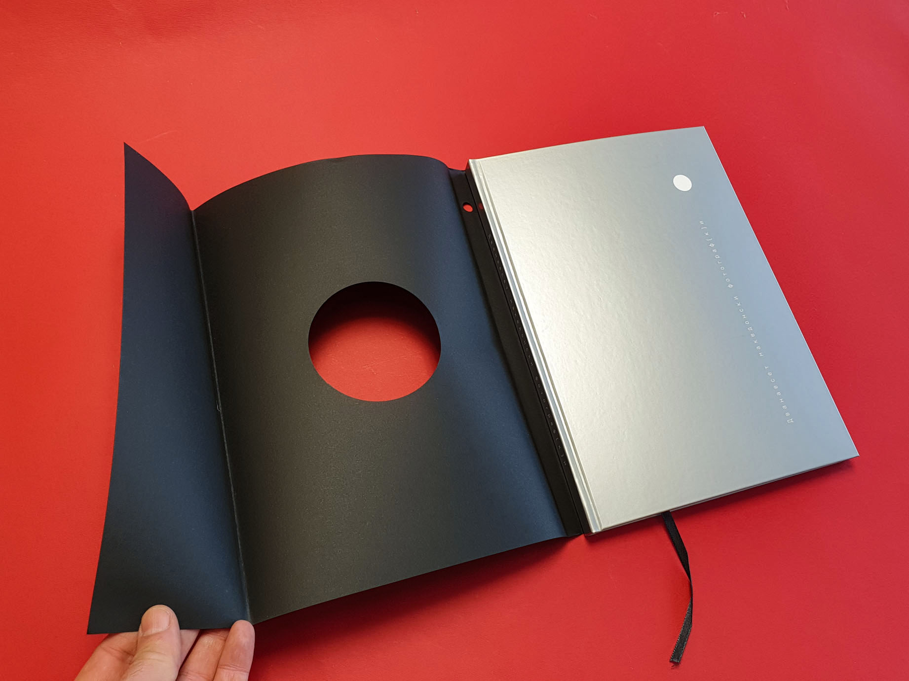
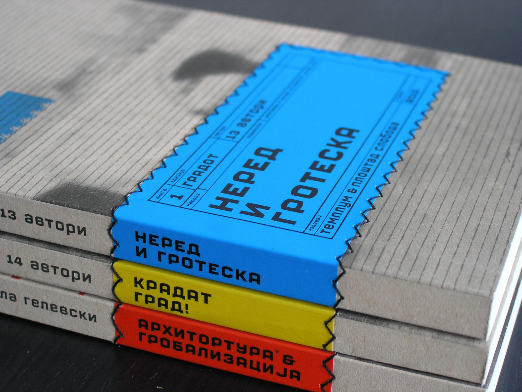
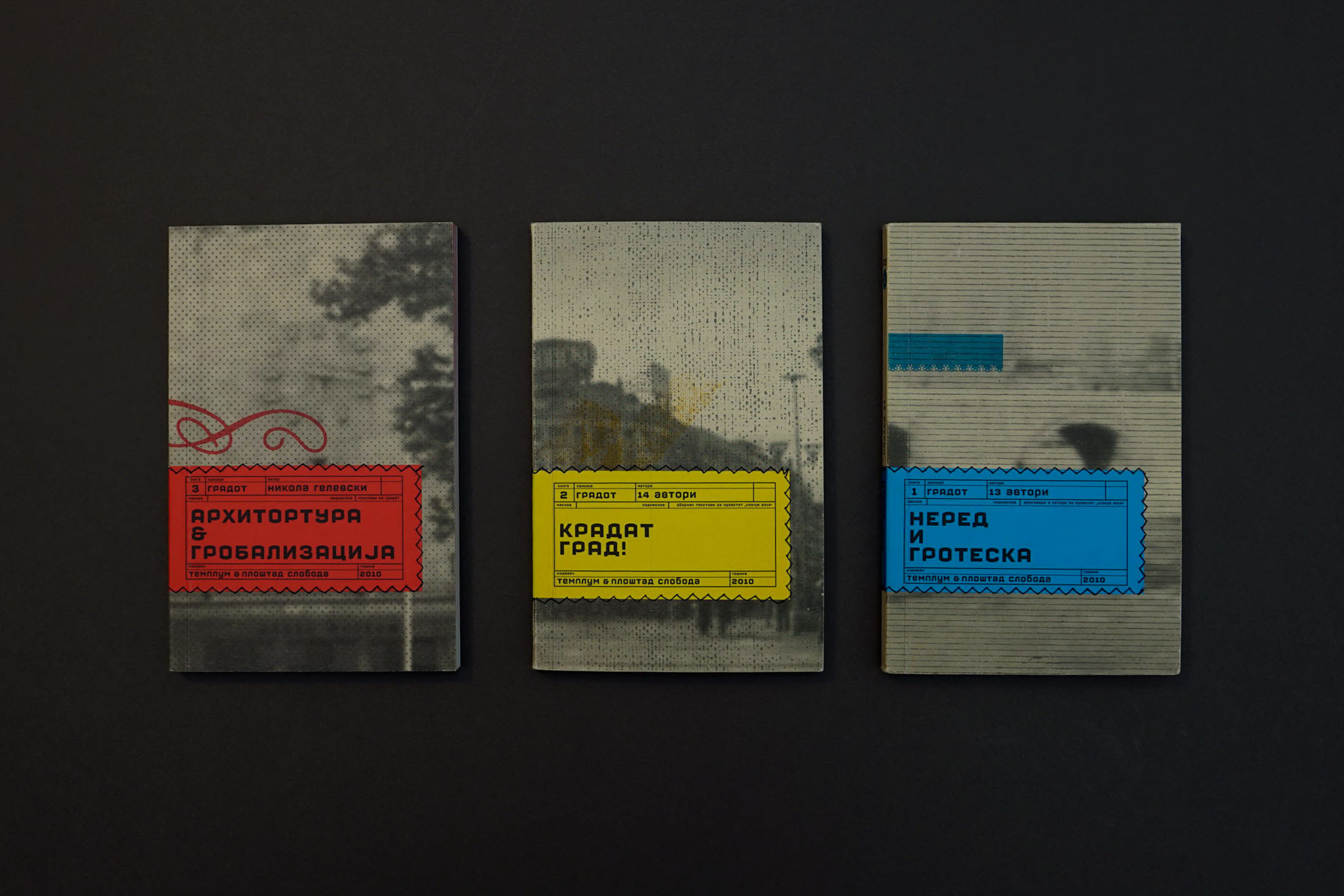
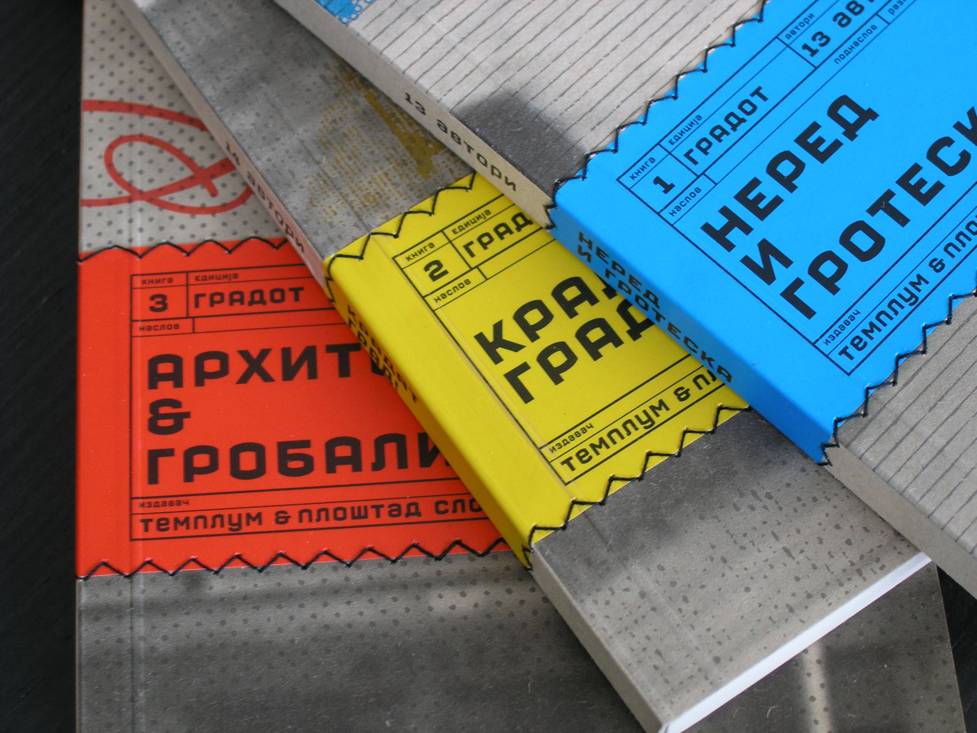
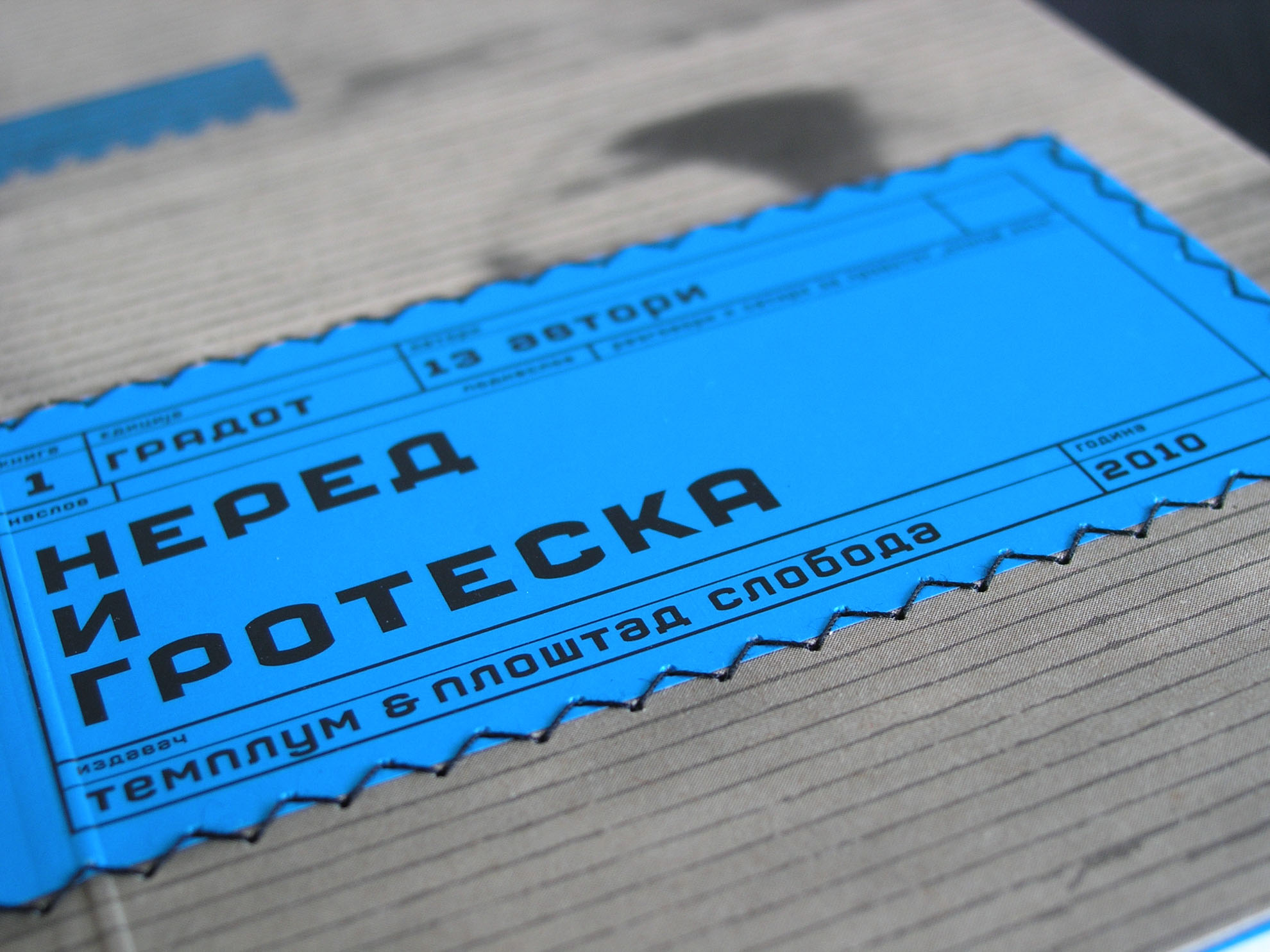
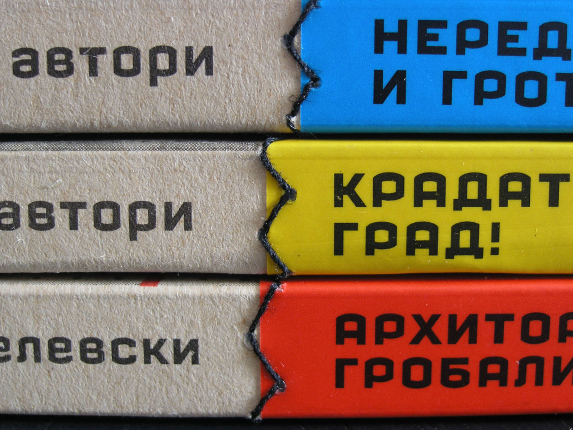
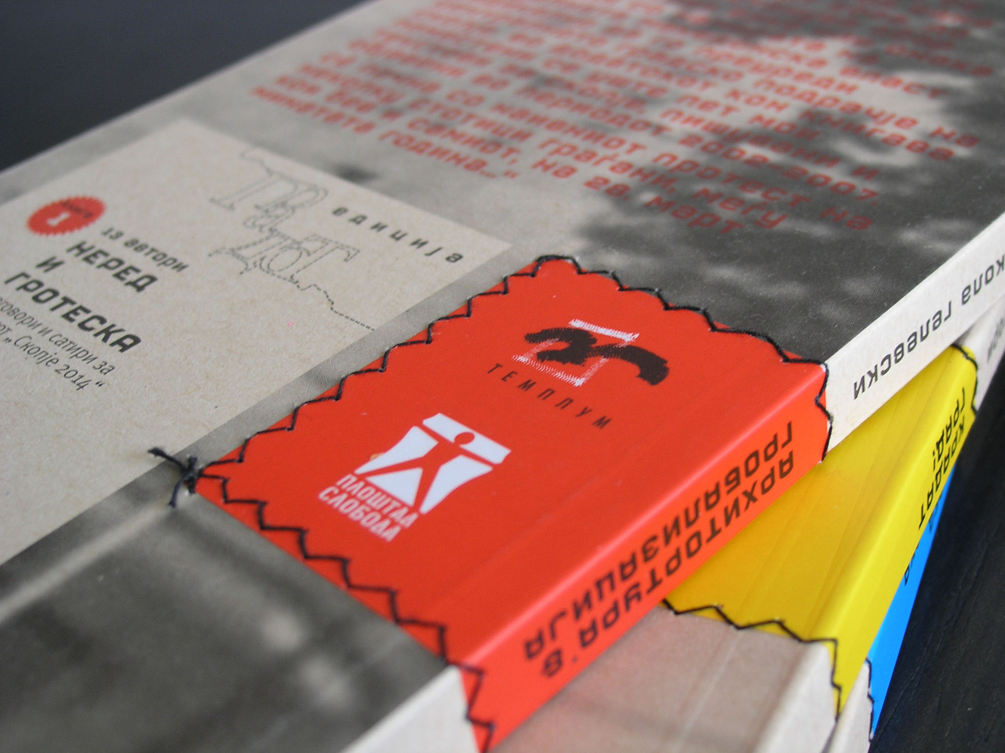
Each cover is built around a clear conceptual gesture that connects the visual language of the book with its content. Instead of relying only on typography and imagery, the designs use material, structure and physical elements such as cut-outs, stitching, layers or attached objects. These interventions transform the cover into a spatial and tactile extension of the narrative.
Why it mattered
By turning the cover into a physical metaphor, the design adds an additional interpretative layer to the publication. The reader encounters the concept before even opening the book, allowing the object itself to reflect the themes, tensions or ideas explored in the text.