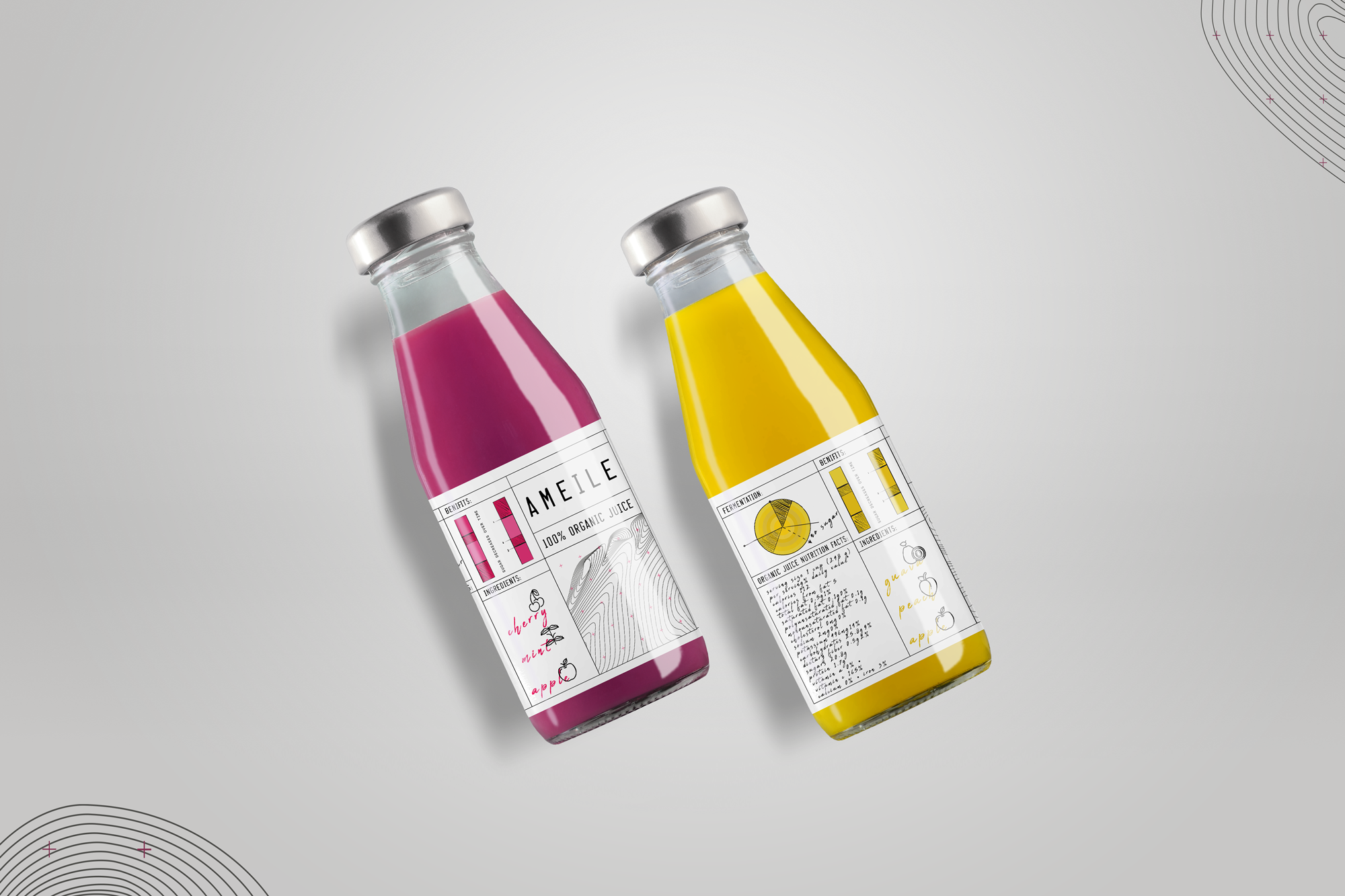
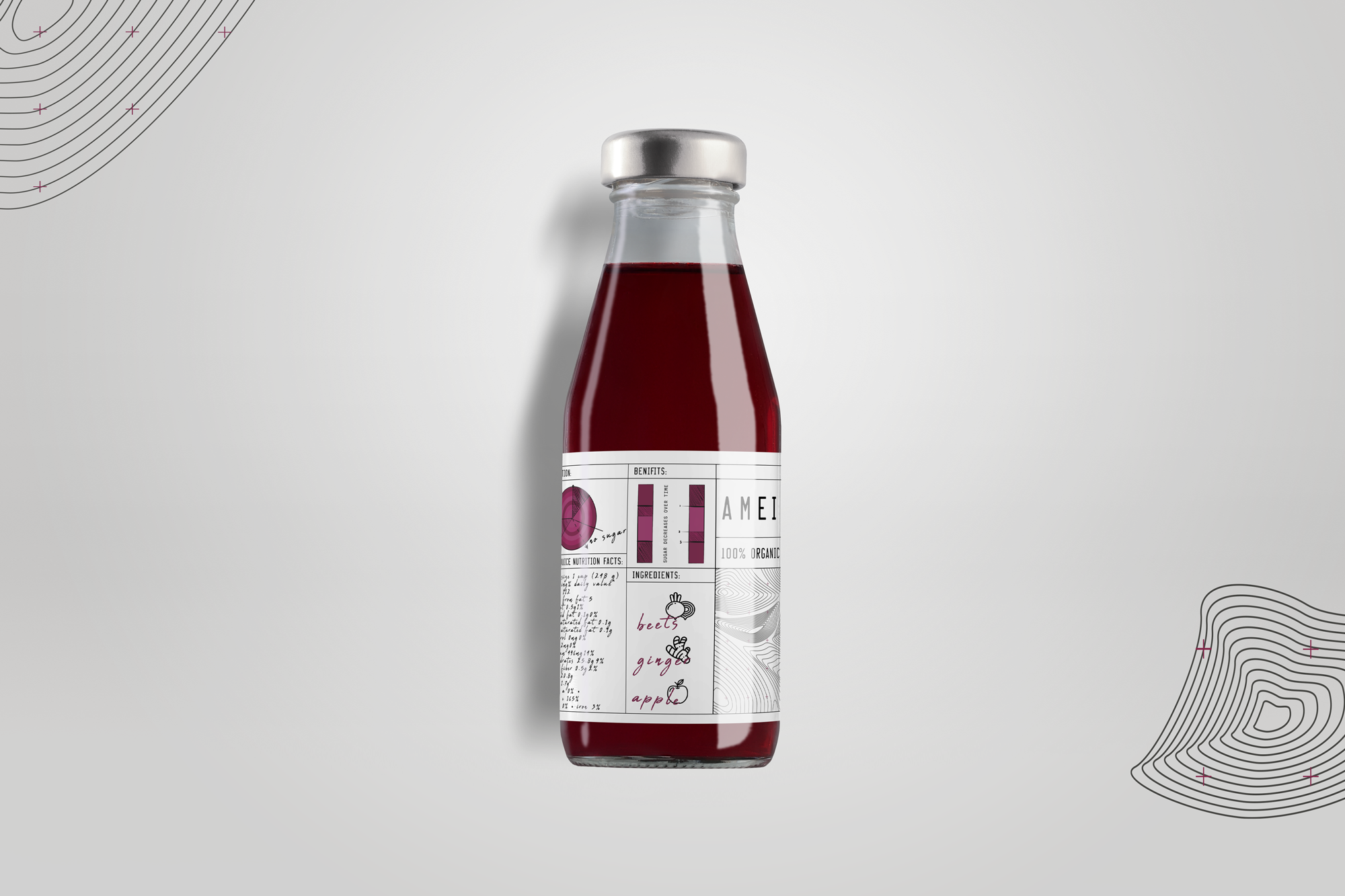
Brand identity and packaging design for an Australian natural juice company, focused on clarity, ingredient transparency and contemporary craft aesthetics.
Context
Steel City Beverage Co. needed a visual system that communicates product purity while standing out in a crowded organic drinks market.
Approach
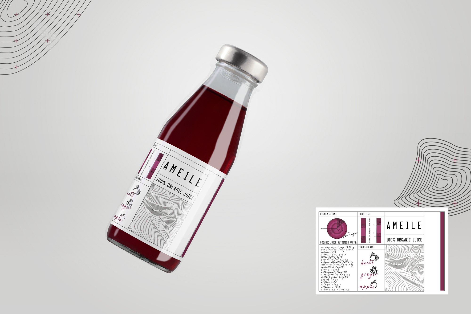
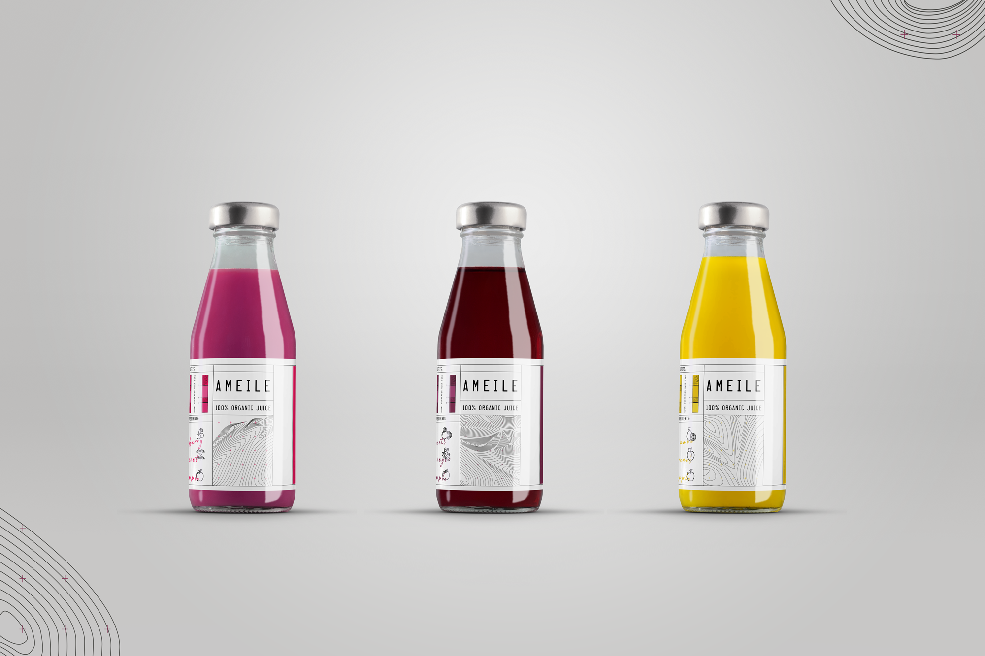
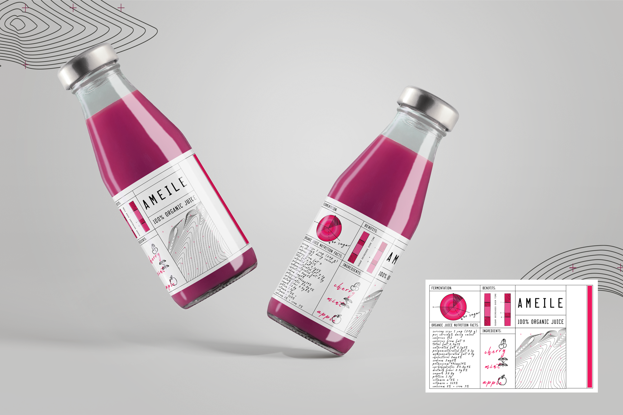
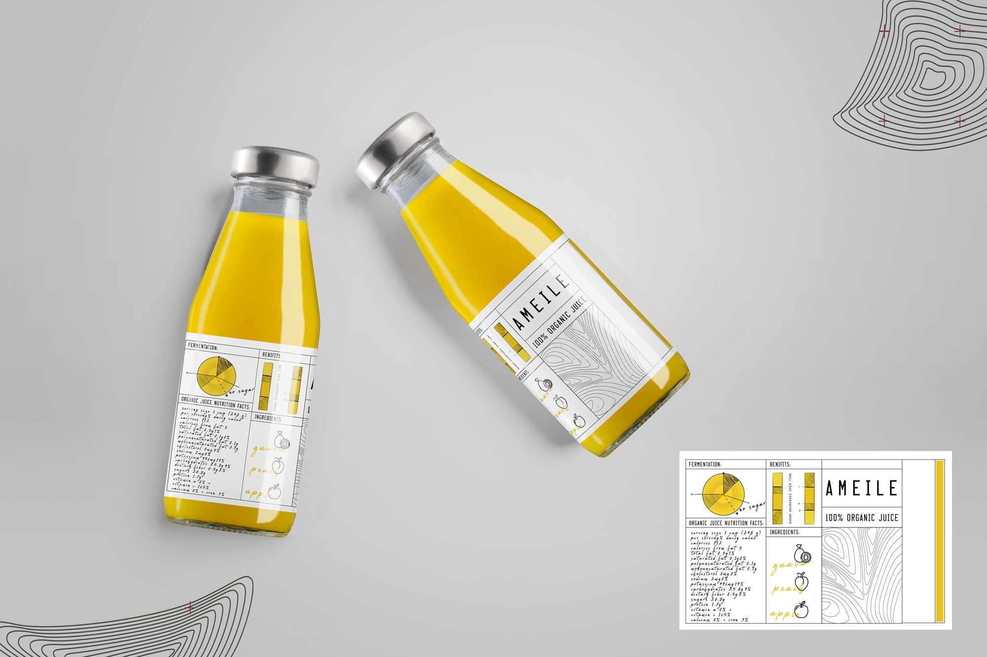
The label combines structured nutritional-data layouts with hand-drawn ingredient illustrations and tactile typographic elements. Technical grid systems meet organic forms, reflecting the balance between science-driven production and natural ingredients.
Why it mattered
The design builds trust through transparency while giving the product a distinct, modern personality that feels both authentic and premium.