These are short notes from the history of KOMA Design Studio, published on the occasion of its 30th anniversary.
Originally shared as a series of short posts, each entry is connected to a specific project, moment or context.
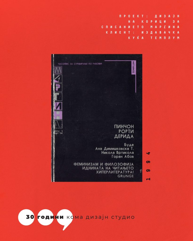
Margina magazine (1994–) was a true Don Quixote of the cultural market in North Macedonia.
KOMA was tasked with translating its ideas into visual form — bold, experimental, and at the time almost unprecedented in local publishing.
This collaboration went beyond design; it was an attempt to open space for a different kind of visual language, at a time when such approaches had no clear place in the local context.
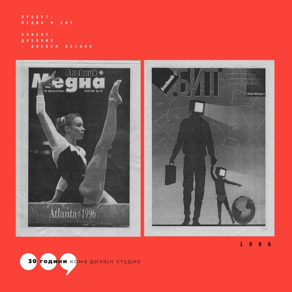
The collaboration with the daily newspaper Dnevnik began in 1996. KOMA was responsible for the design of “Media”, a weekly supplement covering TV, film and comics (editor: Nikola Gelevski), and later “Bit”, one of the first specialized supplements dedicated to computers, IT and multimedia (editor: Goran Gulabovski).
At the time, production was still physical — printed layouts were literally transported by bus to the newsroom. We were working in a period that anticipated the boom of print media in independent Macedonia, with circulations that would later exceed 100,000 copies.
The logos of KOMA Design Studio (1993–2023) evolved together with the studio itself.
Each redesign was intentional — a way to stay in sync with time, to reflect change, growth and adaptation within an ever-changing market.
Special thanks to the designers who contributed across different periods:
1993 — Goce Duchevski
1997 — Goce Duchevski & Nebojsa Gelevski
2003 — Vane Kosturanov
2009 — Vane Kosturanov (with a minor typographic intervention by Nebojsa Gelevski)
2013 — Vane Kosturanov (a version we rarely use — still waiting for it to fully settle)
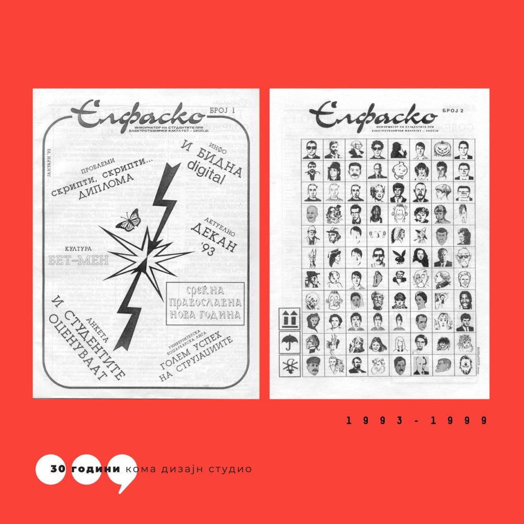
Elfasko was born in the same year as KOMA — 1993.
The student magazine of the Faculty of Electrical Engineering was formalized slightly earlier, and may well have been one of the impulses behind the creation of KOMA.
Between 1993 and 1999, KOMA provided strong logistical and technical support — from design work to training new contributors in computer use and basic graphic design.
In the second issue, somewhat self-referentially, both the Elfasko team and the founders of KOMA appear together — more on that in a future note.
Logo design: Goran Gulabovski & Nebojsa Gelevski
Cover design, issue 1: Goran Gulabovski & Nebojsa Gelevski (designed on Atari STE)
Cover design, issue 2: Goce Duchevski & Nebojsa Gelevski
Three friends decided to start a company for prepress and computer-based print preparation.
The investment was simple: one computer each (not exactly cheap for students) — and themselves.
They needed a printer. Not just any printer, but the best available at the time — the HP LaserJet IV, with a resolution of 600×600 dpi. It wasn’t available locally, so they had to get it from Sofia. How they managed to bring it across the border is a story for another time 🙂
That was the beginning of KOMA.
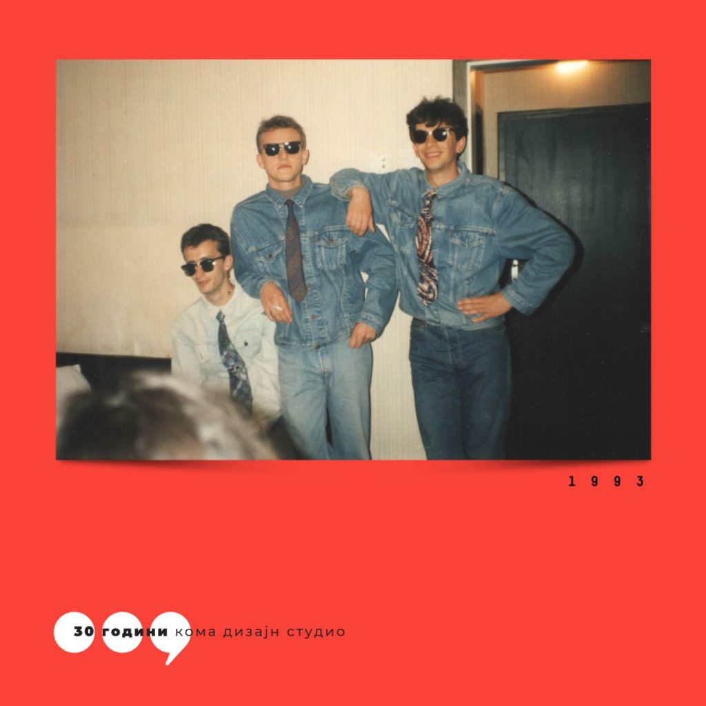
The photo shows the founders around 1993:
Nebojsa Gelevski, Goce Duchevski and Goran Gulabovski.
(As for the fashion — best left uncommented.)
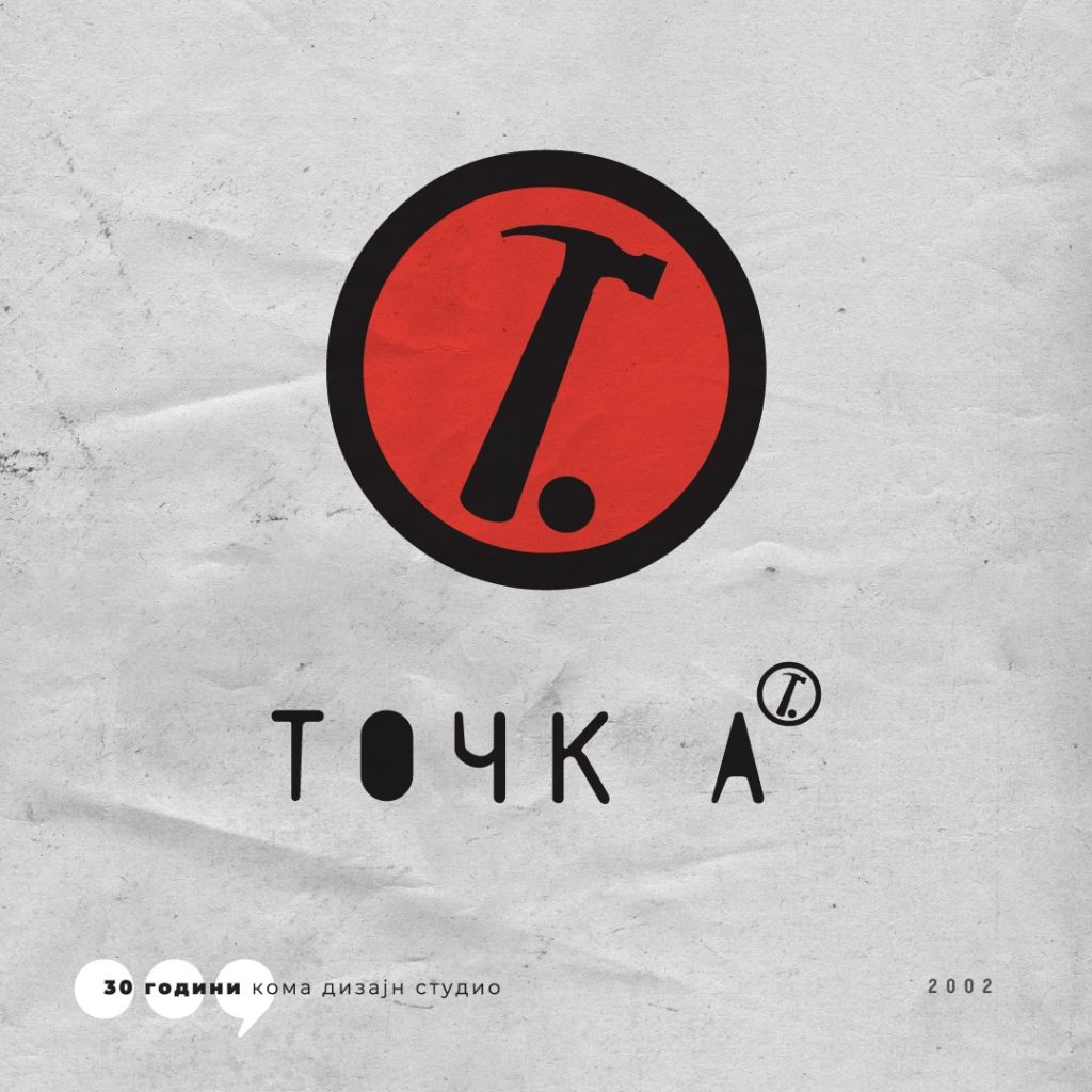
In 2002, we worked on the logo for Cultural Center Točka — a space that quickly became iconic in Skopje.
The concept was by Nikola Gelevski, with execution by Nebojsa Gelevski.
But the real story came later.
During installation, the hammer — originally drawn perfectly vertical to form the letter “T” — was “accidentally” rotated 20–30 degrees to the right, as if in motion.
Artist Igor Toshevski suggested keeping it that way.
We agreed — and from that moment on, the logo lived in its improved form.
A simple reminder that design sometimes happens in the process, not only on the drawing board.
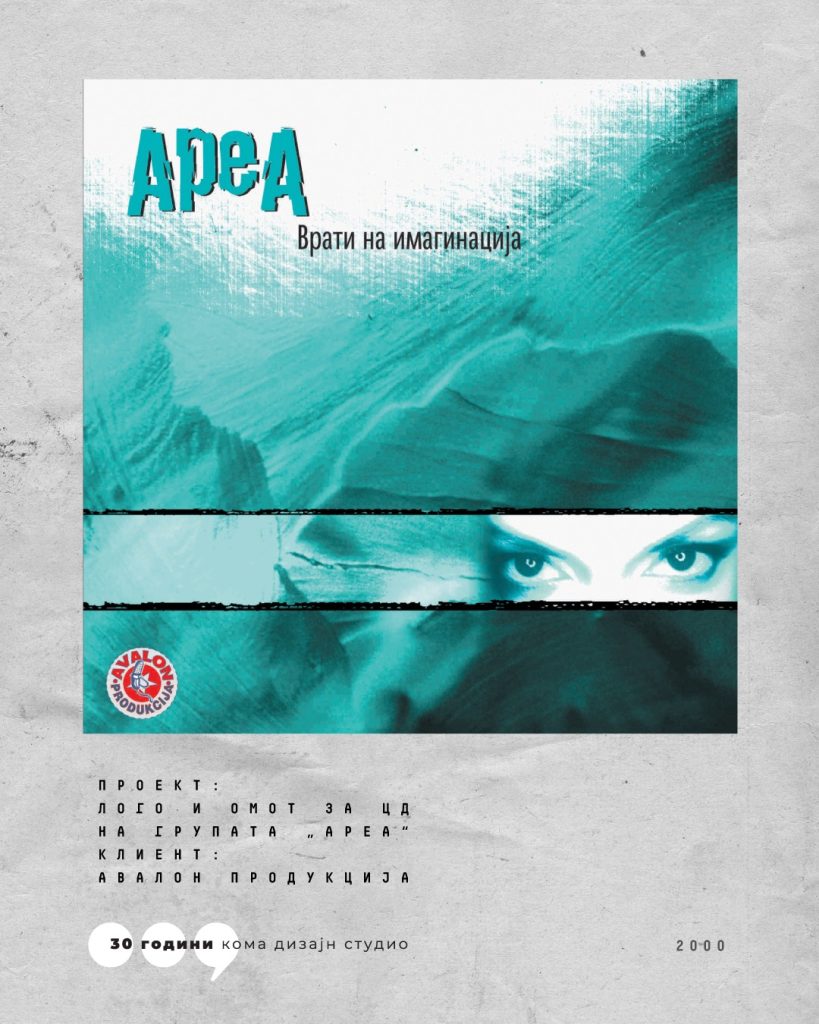
Towards the end of the previous millennium, we began collaborating with Avalon Production.
As enthusiasts of record design, working on CD covers felt like a natural direction.
In the years that followed, we designed around ten releases for some of the most prominent Macedonian artists — Toše Proeski, Karolina Gočeva, Eržana, Break, Igor Džambazov and others.
The first CD we worked on was for the band Area. At the time, many artists didn’t have a defined logo — including Area. We designed both the logo and the cover, and we’re glad to see the logo still in use today — a small imprint of a specific moment in local graphic design.
Design: Antonio Rusevski — Dr. Bonsek & Nebojsa Gelevski
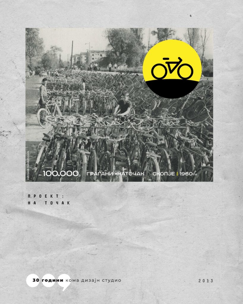
In 2013, we designed the logo and branding for one of our favorite informal activist groups — the Skopje cycling community #NaTočak.
A small project in scope, but significant in meaning. We worked with a group not defined by structure, but by shared energy and initiative.
We’re especially glad the logo is still in use.
Perhaps the best sign that the design has truly lived on.
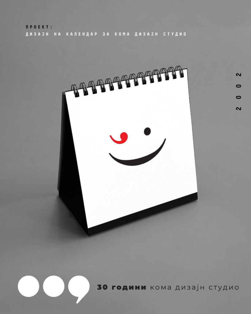
Around 2002, we decided that a design studio should create its own calendars — on its own terms, without compromise.
That decision led to a project that continued until 2023 (with a short break during COVID).
Each year brought a new theme, a new experiment, a new visual language.
The calendars and agendas became a kind of annual ritual — a space for ideas, play and freedom.
For the 30th anniversary, we created a new edition inspired directly by the 2003 calendar.
Digitalization makes us question whether this tradition will continue.
Over the past 20+ years, many ideas and visual approaches emerged — some of them will be curated and revisited in this series.
Design: Gordana Goceva, Antonio Rusevski, Nebojsa Gelevski
Text: Nikola Gelevski (Surrogates project)
Probably one of the most immersive projects we have worked on.
Research, analysis, continuous dialogue — not only with the team, but with the story itself.
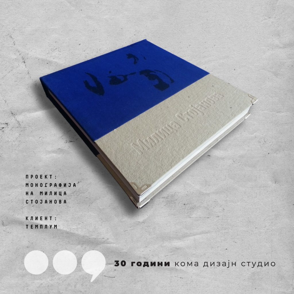
In 2005, together with Škart (Belgrade), we designed the monograph of Milica Stojanova for the publisher Templum.
The process was intense and personal. We tried to understand her not only as an actress, but as a person — through fragments of life and performance.
The cover emerged as a contrast:
soft and tactile (velour) against raw and rough (cardboard).
Her presence is not directly shown, but suggested — like a shadow composed of many roles.